Usually, we’re all for UX improvement – if you find a problem, then why not fix it?
But sometimes, bad UX is more problematic to change then to keep the same.
Here’s why.
Reinventing the wheel rarely gets better results
When a user enters an interaction with a computer, an app, a piece of software – anything, really – they enter that interaction with a preconceived idea of how it’s going to go.
Why? Heuristics.
Every day, we use something called heuristics to navigate our lives. These are a fancy word for mental shortcuts: based on previous experience, we know what to do in a given circumstance so that we don’t have to focus so much energy on doing the right thing, since most circumstances are more or less the same every time.
For example, when you go into Starbucks, you have a good idea of how to order, what they’re going to say and what you’re going to say in return. You know from previous experience how the interaction is going to go. That’s why you can stand in line focusing on other stuff and still know what’s going on.
These shortcuts are what let our brains do all sorts of amazing stuff instead of focusing only on what’s in front of us.

Photo via flickr
However, when things don’t go to plan and our expectations don’t align with reality, we slow down. A lot. And it takes loads of cognitive effort (e.g. thinking power) to correct and get back on the right track.
Good UX will take advantage of preconceived shortcuts. Bad UX forces users to form new roads, which takes longer.
Iconography is really great example of this.
Take a look at the iconography at Ice Jerseys site, for example:
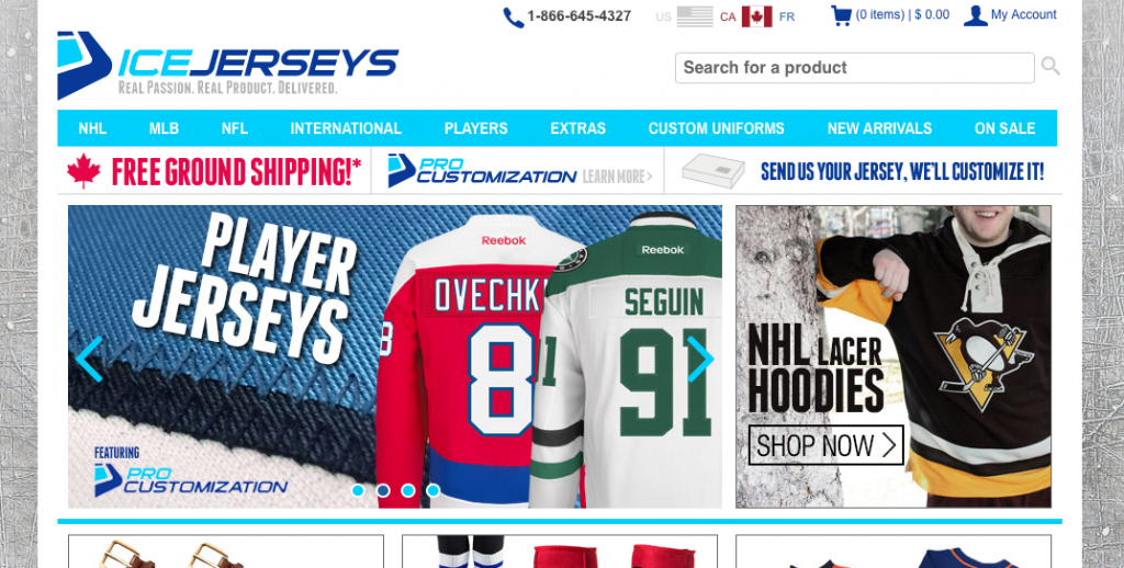
Each icon relies on previous experience, both online and in the real world so that users form a connection faster:
- The checkout icon is shopping cart – just like in a store (and lots of other websites)
- The search icon is a magnifying glass, like looking for something (and like lots of other websites)
- The call icon is a phone, just like you would use to call someone (and just like lots of other websites)
You’ll notice that:
- All of these icons are representative of real world things and
- Each one is used in lots of different websites.
This isn’t an accident. By linking real-world experiences with digital experiences, you get to exploit much stronger heuristics already present in your users.
Second, by using the same icons for stuff that other websites use, you reinforce digital heuristics – for example, that the magnifying glass means ‘search.’
By relying on existing expectations, the designers of IceJerseys.com created a fast and simple site that users land on and immediately know what to do.
This is just one example of an ecommerce site, but the thing is that these icons might not be the best possible icon for the job.
There is perhaps a better icon for search than a magnifying glass.
Likewise, a shopping cart is increasingly outdated. Why not a basket instead? Surely that’s more ubiquitous!
But changing at this point subverts user expectations, slowing down interactions and creating a poorer user experience.
The story of Windows 8
The best example of failed UX in this context is the failure of Windows 8.
TheNielsen Norman Group ran an article titled “Windows 8 –Disappointing Usability for Both Novice and Power Users” and that really says it all.

Microsoft made multiple design decisions that, in all likelihood, were a good idea on paper – but, unfortunately, were absolutely impractical and unwanted by most Windows users.
Microsoft attempted to deviate from the standard Windows format in a way that may very well have enhanced its usability in the long run and future proofed the OS against further developments. In particular, Windows 8 was designed to run as both touch and desktop, a good move for Microsoft in an increasingly touch-centric world.
But it didn’t work. It asked the user to forge too many new heuristics, and abandon too many well-travelled paths.
We all saw the result – an abandonment of 8, an iteration with 8.1, and the rapid redesign and deployment of a new OS, Windows 10 (skipping 9 all together to avoid even the faintest taint of 8 – or, perhaps due to lazy coding).
Here’s where they went wrong.
No start menu
Every single Windows OS until 8 had a start menu. It’s the hallmark of Windows, and is supremely functional for experienced and novice users alike.
When Microsoft scrapped it in 8, they forced users to rethink how they navigate around the computer in a very fundamental way, which is both a slow and unpleasant experience.
Hidden commands
Not everything about 8 was an outright bad idea, though.
They developed a series of universal commands that could be applied to whatever you were looking at. These included share, search, and settings. So you might be looking through pictures and want to share one, you can easily.
And that experience is the same for reading something online that you want to share.
Having one experience across multiple apps is a good idea, but Microsoft forgot that this was a new feature.
It was supposed to be accessed by swiping either a mouse or a finger on the right hand side of the screen to pull out a menu. But without that previous heuristic in place, users struggled to find it and struggled even more to remember it.
The result is that what might have been a good feature was simply confusing when it was present and absent when it was needed.
Conclusion
You might be thinking that revisiting the basics is never a good idea, but that’s not the case. Redesigning even fundamental things can be a great way to improve your UX.
The password confirmation field, for example, can be simply avoided with a ‘show password’ button. Easy and effective, and vast UX improvement.
However, when you are designing fundamental changes to a website, you need to consider:
- Is your change going to be instantly grasped by users?
- What is your uptake time – how long will it take users to write new paths and erase old heuristics?
- What’s the gain? Will your UX improve by a little or a lot?
Some things, like changing the magnifying glass icon to something more search-related (say, an eyeball) is probably not worth it. You stand to have a long uptake time for users to know what’s going on and very little UX improvement.
However, other things, like changing how users enter passwords, might be a huge improvement with a relatively small uptake time.
As usual, it comes back to thinking critically about what your users want and making small, incremental changes based user testing and data.
