In web design, we take a lot of iconography for granted.
Things like the share icon or, increasingly, the hamburger, are just assumed that people know what they do.
But most icons actually have a storied past, a past that is (at times) comically outdated.
In this article we look at 3 icons that we all know what they mean, despite their obviously outdated nature.
The Save Icon
The save icon is probably one of the best known symbols in all of web design. It’s the little square, usually with some silver or contrasting colours (on PCs it’s usually blue).
You know the one.
Well, way back in the day, this wasn’t just an abstract square to represent save. It’s actually based on floppy disks.
You heard right.
When computers were first getting going, floppy disks were the way to save and store information (they were invented in 1971, by the way).
So when the first user interfaces started coming out, it made sense.
But honestly, who uses a floppy disk anymore?
Computers don’t even have a floppy disk drives anymore.
People who are about to enter the workforce were born in 1997, long after floppy disks were on their way out (for some context, AOL started their CD drop in 1993, so even back then floppy disks were already obsolete).
So the icon, while originally based on a logical, tangible thing, has shifted dramatically towards the abstract.
Eventually, no one’s even going to remember it’s skeuomorphic beginnings and it’ll be completely abstract, much like the play button is today.
But all that aside, it’s still incredibly good at it’s job.
In a survey asking people what different icons meant, a full 80% knew that the floppy disk meant save.
Not bad for an icon based on obsolete 70s tech.
The Power Button
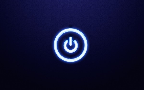
A circle? With a line through it? What is this?
Much like the floppy disk, the power icon is actually based on something from way back when.
To understand, think back to grade 5 science class. Remember how you used to build circuits and connect everything with alligator clips, and when you completed the circuit the light went on?
That’s where the icon comes from.
The line in a power button represented on (since it completed the circuit) and the circle represented off, representing a gap in the circuit.
When there used to be two switches for stuff, this made a lot of sense. In it’s most basic form, you had to actually physically ‘close’ the circuit, like in science class.
Today though, the power button is usually combined onto one button, creating a world of confusion. Plus, there’s actually another icon with a half complete circle that represents sleep, further bamboozling matters.
Again though, as with the floppy disk, while the icon itself is hopelessly outdated, there’s still a lot of value in it.
Why? Because according to the Nielsen Norman group, the most important thing for an icon is being easily recognizable. And the power button definitely achieves that.
The Bluetooth Icon
This isn’t obsolete skeuomorphism as much as it is just plain awesome.
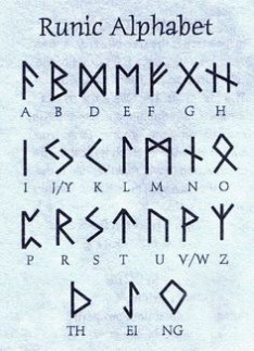
The Bluetooth icon (which is patented by the international Bluetooth approval organization called the Bluetooth SIG) is actually based on ancient runes.
You heard right.
It’s based on the ancient runes for B and H, stacked on top of each other. Why B and H, you ask, and not B and T?
Well Bluetooth is named after a Danish king named King Harald Blåtand, or Harald Bluetooth.
This is where the story gets really good.
So King Bluetooth was called King Bluetooth because he always ate blueberries, which stained his teeth – you guessed it – blue.
The Bluetooth folks picked him as their iconographical inspiration because back in the day, King Bluetooth spent most of his life uniting Scandinavian countries under one king… the same way that Bluetooth now united various tech devices and lets everyone communicate.
So if you’re looking for old fashioned icons, it’s a hard push to get older than 935 AD.
Conclusion
Web iconography is full of quirks and gimmicks that we accept as fact without even knowing why.
Like the power icon or the save icon, there are (or were) good reasons for them to look the way they do, that have since completely fallen by the wayside.
But as long as people continue to know what they mean, it doesn’t really matter where they came from.
The thing is, people and iconography don’t exist in a vacuum, and previous experience informs both design decisions and the user experience.
The result? We cling to old icons, without a second thought.
