Web design is changing – what design trends will be popular this year? If 2013 was the year that mobile devices made a big impact, resulting in the growing importance of the mobile web for website owners, then 2014 is the year that we will see the effect of this in web design. It's already started to happen, with many prominent sites changing to designs that cater for mobile users. Here are five web design trends we expect to see more of this year.
1. Parallax Scrolling
Parallax scrolling is an effect where the background and foreground of a web page move at different speeds, giving a 3D effect which has become very popular. Coming out of the world of game design, this technique gives websites some subtle pizzazz. You can see it in action on the Flickr home page for logged out users). Some effects can be quite complex, though designers have to be mindful of the impact of snazzy effects on performance and
page load speed. See more examples on
Web Design Ledger and
Awwwards.
2. Card and Grid Based Layouts
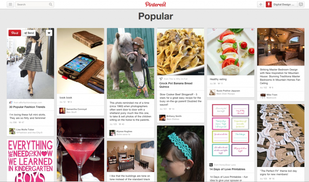
Another popular technique is dividing up site content into a series of cards, grids or tiles. It's a look made famous by Pinterest, so it's not that new, but if you check any repository of website themes, you'll find a lot based on this style. This bit of visual wizardry is possible because of something called the
JQuery Masonry plugin, which provides the script to make the tiles stay in place or move about. One reason this is newly popular is because the shifting tiles are a good way to cater for different screen sizes.
Not everyone's a fan, but if you are you can get some inspiration from these
travel sites.
3. Flat Design
Old-style web design was skeuomorphic – a fancy way of saying it featured icons and images that replicated their real-world counterparts (like the calculator on your PC). Since late in 2013, that's been changing, giving way to flat design. Flat design embraces the fact that we're viewing objects on screen and makes no apologies for being two dimensional. It often features bright blocks of color (think Windows 8 if you must); crisp, large typography and a focus on content. The
advantage is that it loads quickly on all devices and is often easier to use on a small screen. And, as we know, page speed is a big factor in
SEO, too.
Here's some inspiration from
Vandelay Design and
Flat UI Design.
4. Dynamic Targeting
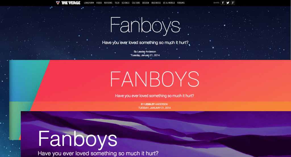
Dynamic targeting is something from the
marketing world, but it's also made its way into web design. This technique automatically adapts the content you see to your device or based on your persona. Try it for yourself by
checking out this article on The Verge – if you look at the same article on Mac/iOS, Android, or Windows, you'll see imagery and styles that reflect your OS.
5. Mobile Elements
These days, the lines between desktop and mobile web design are blurring. Many designers are thinking
mobile first and as part of that we're seeing more mobile elements on websites intended for desktop browsers too. Some are trying to be uber-responsive with
infinite scroll (such as Forbes), though this isn't for everyone.
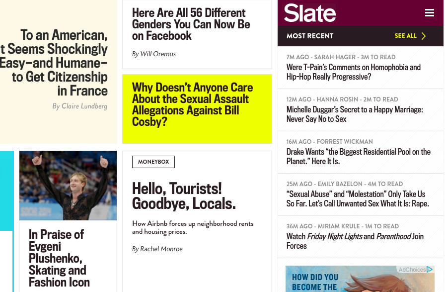
But one thing that DOES work is the use of mobile style hidden navigation on regular websites. Sites like
Slate use three little bars which desktop users can click (and mobile users can tap) to reveal the full navigation menu. This means their content can be more prominent while navigation stays handy – a win for everyone.
Like it or not, you're going to see much more of these web design trends during 2014. Maybe it's time to think about using one or more of them when you refresh your site to be ready for multi-screen users.
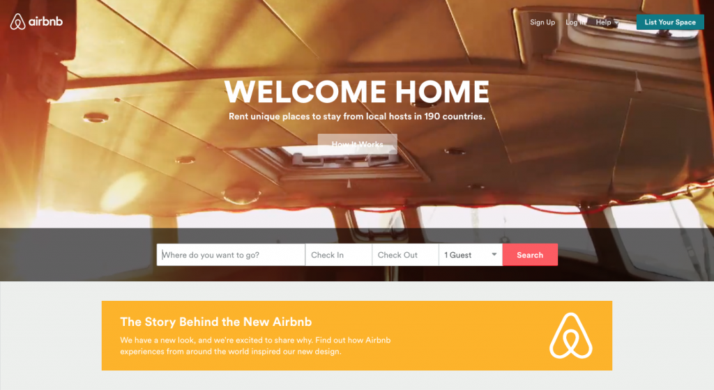
6. Bye Bye Slider, Hello Hero
Web design trends are not just about adding but about taking away. One old favorite that's on the way out is the slider, because
there are better ways to get attention. One of those is the hero area (the large area under the top navigation bar). This has become an important place to
put images – the bigger, the better – to send a clear message about your business. Here's one example from
Airbnb.
7. Focusing on Type
Designers' approach to type is changing. For a start, there's a lot less text on pages, as companies use
short videos to deliver the same message as a page of text. As we know, this keeps people on the site longer, so it's probably a smart move.
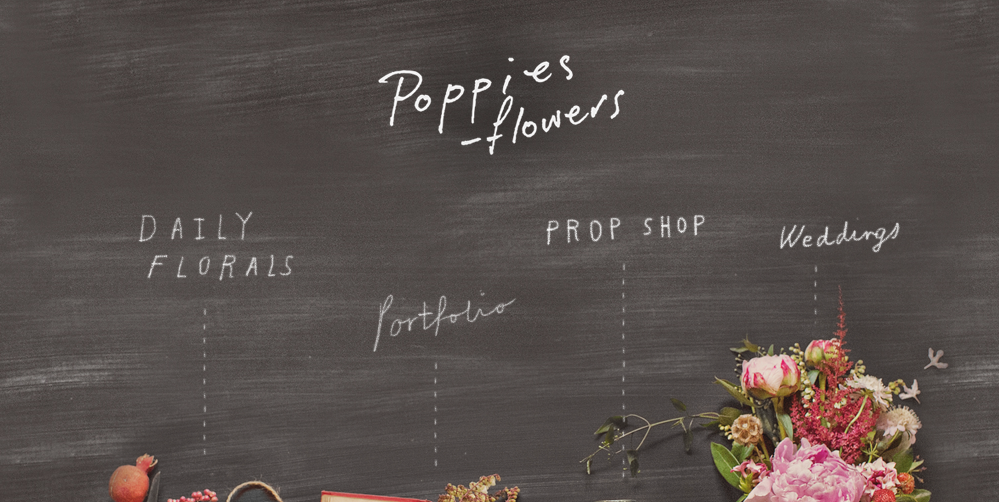
Where type is used, it's got a bit
more experimental, with web pages mixing sizes and fonts to good effect. Check out the
Poppies Flowers site where the navigation labels look like they've been written in chalk on a piece of wood.
8. Single Page Websites
Many of the web design trends come together in the one-page website. These often feature large images, easy navigation and focus on minimalism. They can let businesses tell their story in a simple way and keep the
user experience great for mobile and web users. And they usually use
responsive design. Here's an example on the
BeNumo site.

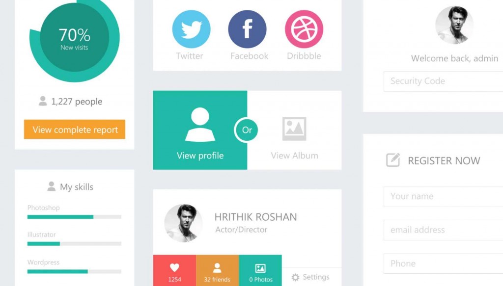
9. UX Goes Micro
Finally, many designers are focusing on
micro UX – getting the small details right that enhances the user's interaction with a website (or app). The
Microinteractions site highlights some well known ones that we probably don't even think about. There are also some good examples in this
Econsultancy article, like the blurry animation below:

These are the trends that will dominate the rest of 2014. What other web design trends have caught your eye?
