At the end of 2015, we predicted some of the digital trends that would be popular this year. As Q1 is now wrapped up, it’s time to take a look at where some of our predictions landed, and what else we can expect for the rest of the year.
2016 trends so far
What’s been going on in the digital landscape so far this year? We’re here to tell you.
Consistency remains key
For the most part, web design has remained consistent so far this year. This might seem boring, but in fact, this is really good news. A few weeks ago, we talked about
how valuable it is for the user experience for all websites to work basically the same way. For example, it’s more intuitive for users if all e-commerce sites work like Amazon or all social media sites have similar functionalities to Facebook.
This consistency with other products is a very useful way to create a lasting and comprehensible digital experience, and we’re happy to see that consistency remains a key part of web design in 2016.
Animation continues to rise
Even more than we expected at the beginning of the year, motion is becoming even more deeply ingrained in web design.
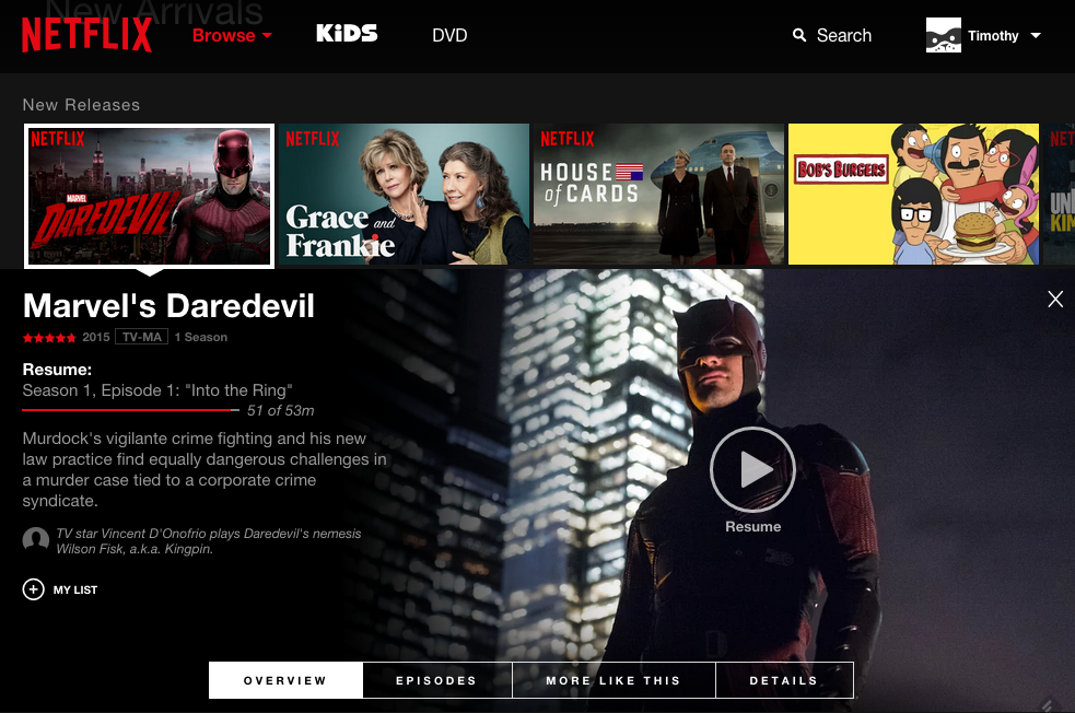
First, video hero images for example, Netflix’s new design, below), are becoming increasingly the norm.
Second, the rise of video on social media, seen with Instagram’s use and promotion of video, Facebook’s continued embrace of video, and the continued growth of Snapchat, all suggest that video content is the new rich content of choice.
And third, the increased use of micro-animations to help improve the functionality of
micro-interactions. For example, a button lighting up when you hover over it, or a subtle movement in an icon to guide your next steps, are indications of the rise of animation, a trend likely to continue – and one that we think should be embraced for the rest of the year.
What to Look Out For
As we continue into 2016, there are a few trends on the horizon that you should be looking out for.
Increased focus on total customer journey
For the last two years, there has been a lot of discussion about
omnichannel experience or complete customer journeys. We expect these broad ideas to come to fruition in a serious way this year.
Specifically, we think that the introduction of more company-specific apps, more in-store targeting, and more
robust and comprehensive online experiences are all going to create a more seamless journey for end users.
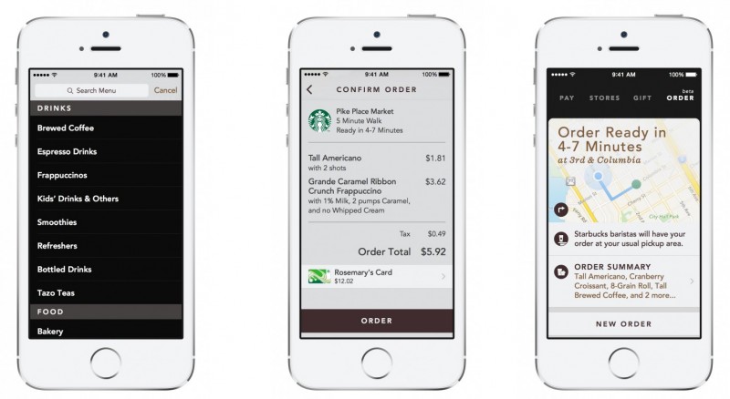
We want to keep an eye on this digital trend because the demand for robust customer experiences is already there. We see it in the wildly successful Starbucks app, where you can order before you get to the store to pick up your coffee. And as that sort of cross-channel experience becomes the norm for users, it’s going to be expected as the standard for all companies to provide it.
Lower tolerance for slow sites
A speedy website is no longer a nice-to-have. User demands continue to soar, and
speed is the first thing to be scrutinized.
This problem is compounded by the substantial increase in browsing done over mobile data networks, which are inherently slower. And as a result of increased mobile browsing, Google is trying to filter out the slow-pokes to improve their users’ experiences navigating search results.
We suspect we’ll begin to see users linking
speed with
reliability, the same way that we saw a link between design and reliability develop a few years ago.
Watch out!
Things that we think have been embraced… perhaps a little early.
Overuse of rich media
Already a problem for some sites, we think that rich media is likely to be a temptation
too tantalizing for many sites in 2016. Rich media like videos and images are great, but their overuse can cause site bloat and subsequently hinder the user experience.
Many creative agencies fall victim to this themselves, in some cases flexing a little bit too much creative muscle, and having a negative impact on the overall user experience in return.
Parallax scrolling
We’ve spoken about
parallax before as a web trend to watch, highlighting some of the pros and cons. But with increased application of this design element across the internet (and in some cases, poorly done), we think it’s a trend best avoided in 2016.

Granted, there are cases when it’s useful. For example, big lifestyle brand websites looking to maximize creative impact should definitely consider parallax. However, for most of us who don’t have a brand like Coke, Red Bull, or Nike to work with, it’s better to simply avoid the parallax.
Why? Because parallax scrolling:
- Has a negative impact on SEO
- Increases load time
- Can have a negative impact on user experience (e.g. “scrolljacking”, or the elimination of native scrolling)
So for the consideration of most users, we suggest steering clear of parallax.
Conclusion
All in all, we’re excited about what 2016 is bringing to the table – from the different creative trends like animation and cohesive customer experiences, to the general overall improvement of digital products and journeys.
There are, as always a few red herrings to creating great web design, like abusing rich media without a thought for the end user, or embracing parallax scrolling without thinking through the consequences. But regardless, we’re excited about what the rest of the year has to bring.
What are you excited about for 2016? Let us know in the comments! 