You know what they say: you only get to make one first impression. The same is true for your web presence – you only get one shot at grabbing a visitor’s attention and keeping it long enough to make an impact. To do that, you need:
- Clear communication
- Tested and optimized design
- Speedy responses
We’re going to tell you how to do it.
Clear communication
First, you need to have clear communication for your user. You need to tell them where they are, what they can find there, and give them a path for the next step.
If you let your users wonder where they are, they’ll simply go somewhere else that they understand.
You need to make sure that people are landing on pages that are relevant to what they’re looking for. This is where your SEO strategy really comes into the picture. Structuring meta data, on-page SEO, and your off-page links to be consistent with what you talk about is extremely important. When you’re thinking about SEO strategy, remember that there’s no point in having all the visitors in the world hit your page if they simply bounce off it.
[caption id="attachment_4603" align="aligncenter" width="541"]
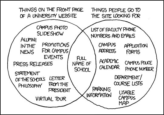
via
xkcd[/caption]
So now that the user knows where they are, you need to convince them they’re in the right place. We recommend (as always) clean, clear communication. Simple headlines, simple navigation, and a simple website design are going to be the best way to control user expectations and get them to stick around.
Finally, you need to provide your users with options for what they can do next. This is where your
calls-to-action (CTAs), site information architecture, and overall user journey become very important.
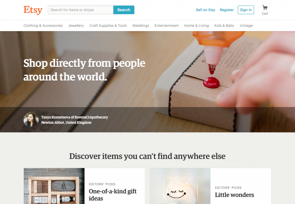
E-commerce sites, such as
Etsy for example, tend to be very good at this. This is mostly due to the user journey for online stores being more familiar for the general population – after all, most people have purchased
something online at this point. But it’s also due to the simple and always visible navigation that Etsy provides. From their homepage, users instantly know what to do, how to find things, and where to go next.
Tested and optimized design
The internet is unique in that, while you can’t redo your first impression, you do get the opportunity to make
thousands of first impressions a day. It’s like if you could go on hundreds of first dates an hour – over time, you’d hone your first date game.
Likewise, testing and optimizing your website to make a great first impression is essential. We think the three most important things to work on are:
1. Your calls to action
There’s not a lot of general science you can apply to your call to action copy and design. Sure, there are general guidelines from
colour theory or
copywriting principles, but the only way to know what works for your specific needs is to
test it.
We recommend regular multi-variant testing on your CTA placement, design, and copy to see what configuration works best on your users.
2. Your customer journeys
Knowing how your users move around your site, locating pain points, and having the insight to fix them are key to generating a positive user experience from the start. The challenge is that over time users will ‘learn’ your site; however, the steeper that learning curve, the more vicious your bounce rate and customer journey drop off is going to be.
The solution to this challenge is twofold. First, you need to understand your customer journey through your website. Any analytics program like Google Analytics can help you with this, showing you where users enter, where they go, and when and where they exit.
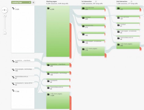
With this information, you can then pinpoint drop off points – places where something’s not quite right and where your users are exiting at a higher-than-average rate.
Second, we
recommend one-on-one user testing to guide the user through the journey and capture their feedback as they cross the drop off point. We’ve found this is the best way to get to the bottom of why a customer journey is not going the way it’s supposed to, and it gives you a good opportunity to fix it.
3. Page layouts
Page layouts are the final crucial aspect for you to test and optimize. Where elements live on the page and how quickly they can be found will make or break your first impression. For example, if a user lands on your page and has no idea where to find links to relevant content, no idea what page they’ve landed on, or what other pages your website has, that user is likely to leave.
The best way to find out how your website is performing is a combination of heat map data, A/B testing, and user testing.
Heat map data will show you where your users are already looking. That way, you can put the most important bits there.
A/B testing provides you with the data to actually begin to improve your page layout, testing various options to improve your site.
And finally, user testing is a great way to get to the bottom of what might be going wrong – straight from the horse’s mouth.
A speedy website
Lastly, the best way to make a good first impression is to make it
fast. In the
world of website bloat, a slim site is the way to go. From a design perspective, there are some general guidelines you can follow to achieve this, such as:
- Restricting your use of rich media
- Limiting your use of fonts to one family
- Limiting the complexity of your style sheets and layouts
- Reducing the amount of complex graphics you’re using
However, if you already have a website designed, then you can still inject some extra speed into it by simply changing how your website serves users:
- Compressing all your images and videos
- Changing your hero videos to only play on desktop
- Reducing the number of plugins
- Changing to a generic font
These small changes can make a big difference to how fast your website is, and thus, how quickly you can make that great impression.
5 point summary
- The key to making a great first impression online is clear, concise communication, constant trialing and optimization, and a speedy website.
- Clear communication is best achieved by focusing on the key message for your user and their key objectives: what one thing do you want to tell them, and what one thing do they want to hear?
- Optimizing your CTAs, your customer journeys, and your page layouts should be combination of constant multi-variant testing and real conversations with real users.
- Building a speedy website should be a requirement from the start…
- … but even if it’s not, there’s still plenty you can do to drive your site faster and better.
Happy designing!
