1. Shopify Annual Report 2013
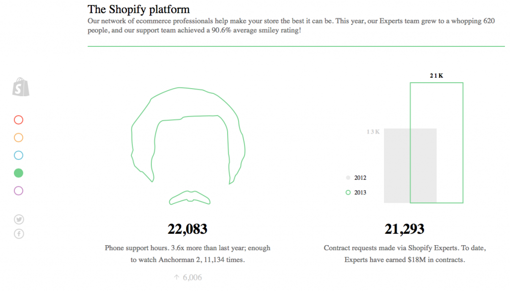
Shopify hits a lot of the high points we were talking about two weeks ago, and they did it in 2013. They use subtle animation and movement to capture and hold attention – for example their round trip animation.
What we especially liked was the colour-coded, elegant and simple navigation on the side to help you jump around the report however you wanted.
2. Mailchimp Annual Report 2013
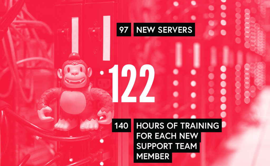
Always beautiful, Mailchimp built a beautiful annual report in 2013. And of course, being Mailchimp, it looked great on a mobile screen as well. With a simple scrolling message of numbers that always increase (both professional number and more casual ones like ‘softball team wins’) they build the pace of the annual report.
Gradiated colour changes and stunning background images are really only the icing on the cake. Plus, they designed it so you can link a particular section, which is a perpetually useful function.
3. Ustream Annual Report 2013
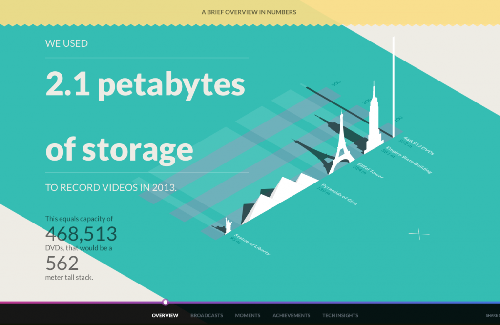
In 2013, Ustream built a fantastic annual report using parallax scrolling. By controlling the pace of scrolling and adding in plenty of on-trend design features (flat design, pastel shades, mixed typography, etc.) they create a fun and engaging story to for their readers.
Plus, they have a bar to track progress (always handy with parallax scrolling) and easy sharing for a truly awesome user experience.
4. Serguros Pelayo Annual Report 2012
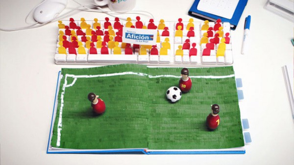
Less an annual report and more an annual video, Serguros Pelayo’s 2012 digital annual report is actually a totally gorgeous and engaging stop motion video. It’s cute, it’s quirky, and it’s endlessly amusing.
And by simply capturing the stills of the shots with numbers, it’s also informative and useful for readers. While it’s a little out there compared to other reports, it is still a fantastic display of creative problem solving for how to connect with annual report readers/viewers.
5. Warby Parker Annual Report 2013
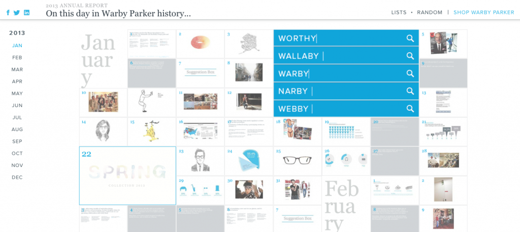
Of course, how could we profile top annual reports without a nod to perhaps the original viral report? Warby Parker (who make glasses, by the way) created a report in 2011 that went viral, displaying the health of the company with beautiful infographics. But the story didn’t stop there. In 2013, they created an equally engaging annual report.
It’s a giant calendar, showing what happened every day at Warby Parker. Some days it is little things, like saying goodbye to a high school intern. Other times, it’s major news, like launching a new collection. Either way, it’s a fun way to see what’s been going on for the past year, which is really the point of any annual report. Plus, it’s 100% searchable, so if you know what you want, it’s easy to find.
6. Electrolux Annual Report 2014
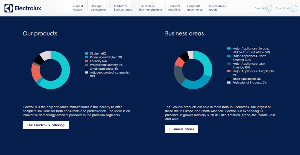
Electrolux’s annual report is big, beautiful, and delightfully simple. But what we loved most was the easy navigation. Running horizontally rather than vertically, it’s an absolute pleasure to use on a big screen. (And with a responsive design, this goes to a hamburger on a mobile one.)
Beyond that, each menu expands into more options, easy to see and use with excellent use of colour to delineate submenus. What’s more, the whole thing is searchable, downloadable, and shareable.
While perhaps not the most creative report here, Electrolux does a fantastic job of doing something simple but doing it really, really well.
7. CPA Ontario Annual Report 2015
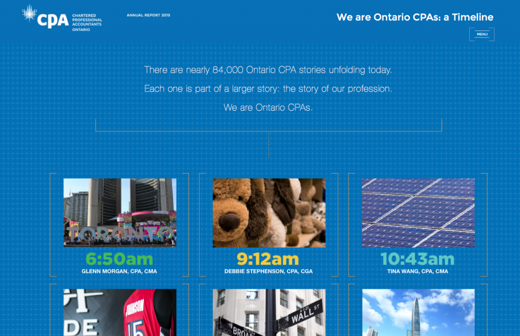
The 2015 CPA Ontario report is one we’re particularly proud of, so thought we’d mention it here. It makes great use of subtle movement to give feedback to users of where they are in the report, and with a simple clickable menu, getting around is easy.
One design feature we especially like is that the report lets users click to get more information, creating nice user flows through what would otherwise be a dense and unpleasant document. And, of course, the whole thing is responsive, so it’s great no matter what screen you’re on.
8. Lemonade International Annual Report 2013
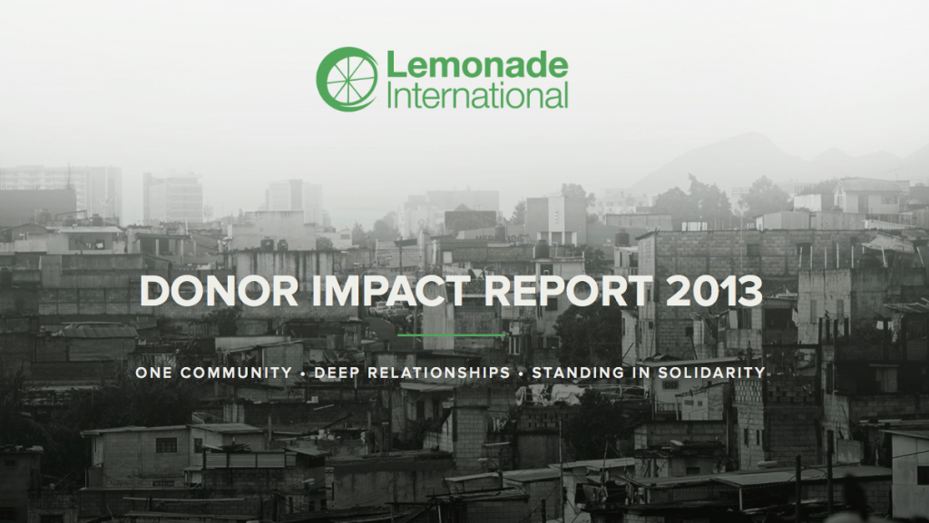
Lemonade International’s report is perhaps a little smaller and less complicated than other reports we’ve mentioned here, but in a lot of ways it’s better for it. It’s a quick overview of the organization, beautifully designed and presented with a strong colour palette and clean, clear typography.
For small organizations or charities, this is a great source of inspiration. One characteristic we especially like is that a lot of their links go back to their own website. It demonstrates an embrace of the digital report that is unique to the reports we looked at, and is a technique we feel more companies should use. There’s already killer content online – why not share that with people who are reading your annual report? Odds are, they’re going to be pretty keen for a read.
9. WPP plc Annual Report 2014
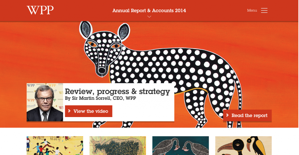
WPP plc’s annual report in 2014 at first blush isn’t much to look at. The look and feel is maybe a little dated, and nothing really leaps out as amazing. But scroll down a little, and the report’s true functionality opens up like a flower.
First, readers have the option to watch a video summarizing the report rather than reading it. Brilliant, in a world of video.
Second, they have a ‘quick reads’ section summarizing the various parts of the report into easy to digest chunks.
And finally, instead of downloading the whole report (although that’s an option) you can download specific sections, like the aforementioned quick read summary or their financial statements. In fact, their financial statements are right on their homepage.
This is a great break from UX convention of having all the downloadable content together, in response to the fact that most people reading annual reports probably want a quick summary and some hard dollar figures.
So there are 9 reports to really get you going. But what are your favourite reports? Let us know in the comments!
