Photo: Luke Wroblewski
Although apps have been around for years, 2013 was the year that many webmasters put a focus on mobile website optimization. Given that the number of smartphones on the planet will surpass the number of PCs in the next 6 months, apps and mobile websites are going to continue dominating trends in 2014.
In the past we've extensively covered the different approaches we recommend for mobile web strategies depending on the situation, but one of the most popular mobile trends this year was responsive web design.
Problems with responsive web design
Responsive web design was just as popular in 2013 as it was in 2012 (if not more so), but increasingly we've seen that it's not the one-size-fits-all solution that many thought it to be. In a lot of cases, the front-end expression of a desktop website is too complex to translate well to a compressed mobile version. Even if you hide or disable features, the content isn't always presented to mobile users in a way that's very well optimized.
If you've been paying attention to recent developments in search engine optimization (
SEO) you've probably heard about voice search, the technology that allows you to talk to your computer or mobile device and have it talk back to you.
Usability
Compare the examples below and think about which you'd rather use:
Time.com using responsive design on the left, or
The Economist on the right, utilizing a dedicated mobile site.
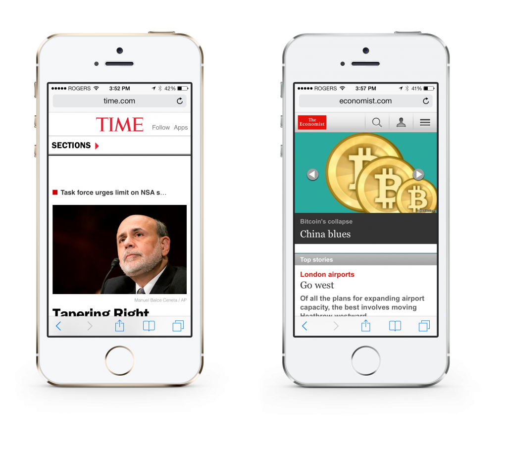
Responsive (left), Dedicated (right)
Because Time.com is essentially running a stripped down and condensed version of the desktop site, it doesn't make very good use of the screen space and even has the text of headline news items cut off. Between these options, a dedicated mobile site is the obvious choice.
This isn't to say that all responsive sites are bad, because that's not true. At Enginess, we have launched and continue to develop stellar responsive sites – but in some cases, it simply doesn't work.
Speed & SEO
Not only can responsive web design hamper the usability of a website on a mobile device through clutter, but it can be slow, too. Consider the following chart:
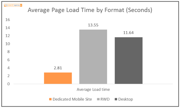
Responsive design is the clear loser when it comes to page load time, which is now not only being used as a measurement of user satisfaction, but also search-engine optimization. If your mobile site is slow,
Google is going to de-rank your site. So, does it make sense to load all of the high-res photos and scripts that are used on your desktop site for mobile users too? Probably not.
In 2014, more of those in the web industry are going to experience frustration and the drawbacks inherent with responsive web design, and beginning using alternate options to achieve success on smartphones and other mobile devices.
What you can do about this
There are numerous options to properly serve your content to mobile users, from native apps, to hybrid apps, to dedicated mobile websites. From a website perspective, the easiest alternative to a responsive website is a dedicated smartphone (and optionally, tablet) experience, that gives mobile users all of the information they need from your site, but in a lightweight and touch-optimized format. Of course, it's important to make sure the dedicated site's dimensions can flex to fit a variety of screen sizes (e.g. everything from the iPhone
4
to the Samsung Galaxy S4), and that users have the option to view the full site if they want.
Content management efficiencies
In the past, one of the main drawbacks of running multiple versions of the site was the management of each front-end as a separate website. Depending on the way the mobile site was set up, you might have to duplicate any content updates you perform on your desktop site with your mobile site, making website updates inefficient and a hassle to complete. With this in mind, it's important to run your main website, mobile site, and any other site you are running from the same content management system, and one that is able to seamlessly publish the same version of the content to all of your front-ends, and keeping any content updates consistent across devices. Platforms like
Advantage CMS are excellent at publishing to mobile-optimized websites.
More fragmentation on the way
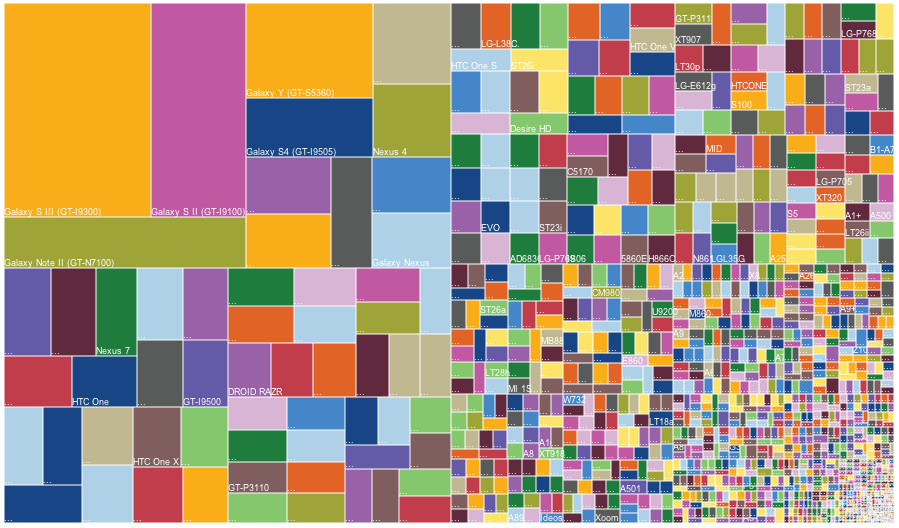
Already in 2013, the range of screen sizes used to access the internet is enormous. The image below shows just those of Android devices:
via
iDownload Blog
In 2014 there will be more widespread adoption of 4K displays, as well as the mass market introduction of proper wearables – specifically, Google Glass, and the widely predicted iWatch from Apple.
The range of device sizes that will be used to browse the web in 2014 will be so wide that responsive web design will no longer be the silver bullet we've used it as in a world that's been primarily focused on browsing from desktop, tablets and smartphones.
How to prepare for greater screen size fragmentation
We're proponents of using the right tool for the right job. And in some cases, that means that responsive design will be the right choice. In other cases, an iPad app may be the right choice. And in other (fewer) cases, a Google Glass app may even be the right choice.
Regardless of the new devices that are introduced in 2014, it will be important to measure your online goals against your existing website analytics data, and planning for the future in proper phases.
If you have any questions about your mobile strategy for 2014, leave us a comment below and we’ll be happy to respond to you.
