Marketing lives and dies on its Calls To Action (CTAs).
Whether you’re running an email campaign to a list of thousands or building a lead generation website, CTAs are going to play a very important role.
But what is it that is going to take your audience from browsers to buyers?
We’re here to help answer that very question with a few CTA tips and best practices.
A/B Testing
It’s unlikely that the very first CTA you send out is going to be the optimal performer. Plus, if you have nothing to compare it against, you have no way of knowing if your 20% click rate is good, great, or totally abysmal.
A/B testing is one way to test and iterate your CTA that’s easy to implement. Basically, it’s when you send out two versions of the same thing to different people with slightly different CTAs. Whichever ones does better, you keep. Rinse and repeat.
For example, imagine you are running a email campaign and wanted to do some A/B testing. Here’s how it would work:
- Split your list into two. Do this randomly. (some people like to use a smaller subset then send the majority of the list the improved campaign).
- Write your email, but change one thing. Only change one thing, or else you won’t know what is making the difference (e.g. colour, copy, size, location, font).
- Send your campaign.
- Track a chosen metric (more on metrics later) and see which one performs better.
- Take that insight (e.g. orange gets more clicks than red) and iterate. Maybe next time change the copy, or the location. Constant small iterations will mean that your campaigns are continually producing better results.
Copy’s important. Really important.
Your CTA, whether it says subscribe, buy or register is one of the most important pieces of copy you’ll write. It’s one of only a handful of places that you can write something and be pretty much certain your audience will read it.
Keep it really simple. It doesn’t have to be the most branded or the most creative copy. All it has to do is:
- Tell your audience what to do.
- Tell your audience what to expect when they click your CTA.
You don’t have to reinvent the wheel.
To write a great CTA that converts, you want to be super relevant to your audience.
One way to do this is to phrase your CTA in the context of whatever it is your audience wants. For example, if you’re trying to get people to sign up to your string of gyms, and gym location is a really important decision factor, phrasing your CTA find a gym and get membership will return better results than get membership. (This is actually a real example from Michael Aagaard, and it improved conversion by 68%.)
Write a CTA that benefits the reader
Neil Patel calls these benefit-orientated CTAs, which we really liked. What it means is that you explain exactly what benefit the person is going to get if they do take whatever action you’re trying to get them to take. For example, look at Keywordtool’s CTA:
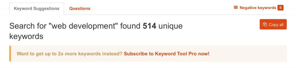
Want to get up to 2x more keywords instead? Subscribe to Keyword Tool Pro now! It’s crystal clear what the user is going to get out of clicking on that CTA – 2x more keywords!
Metrics
If you’re A/B testing, and you’re writing great copy, then you need a way to measure what’s working.
Hubspot recommends tracking your click through rate (CTR). It’s the percentage of people who see the CTA and decided ‘you know what? I’m going to click that!’)
Another good metric to track is the inverse, the bounce rate (the percentage of people who see it and say ‘nahhh’ and then leave without doing anything else).
In combination with A/B testing, you can figure out (over time, of course) what is driving people forward. Maybe it’s when your CTAs address specific problems, like Aagaard’s gym example. Or maybe it’s when you use red, because people associate it with a sale.
Whatever it is that makes people click, if you’re tracking data over time you can figure it out.
Other good metrics to keep an eye on are demographic metrics. Are your CTAs resonating disproportionally with any one group, like small businesses, or start-ups? Are your CTAs being opened only by women or only by men?
Each of these represents a chance to segment your audience and deliver more tailored content, and drive better engagement. Your audience will be happy for more relevant info, and you’ll be happy with more conversions.
Give something away for free
Lots of service companies do this because it’s a great way to drive conversions. Nothing gets people to commit to something like a free taste.
This is really the ‘foot in the door’ technique – the free trial lowers the size of the primary request to increase the likelihood that the user will agree now and then agree to a larger request later on (e.g. to buy your service). There’s also the value of selling by doing, where if you experience the product or service yourself you’re much more likely to buy it.
So if you want to drive your CTAs, then offer a free trial! The trick, of course, if driving those free trial-ers to actually buy your product.
Make your CTA agonizingly tempting
You know when you have a Buzzfeed or Upworthy article pop up in your Facebook feed and it’s nearly impossible to not click it? You really don’t care about How Stereotypically Posh British you are (apparently not very) but you are compelled to click it!
You want your CTAs to cause the same reaction.
For example, QuickSprout has a great modal window CTA:
Give me three months & I’ll open the floodgates to consistently profitable traffic to your website. Show Me How Instantly
How badly do you want to click that!?
Tell people what you do, not how you do it
According to one of Andrew Sorbel’s rules of curiosity, you should “tell people what you do and the results you get, not every detail about how you do it. The former is interesting, the latter can become tedious.”
CTAs should be designed to do the same thing. Focusing on results is a great way to drive conversions (especially if you put it into the context of the end user).
mHelpDesk’s copy is exceptional at this:

Field Service Software – get organized and win more jobs
mHelpDesk is a mobile field service management software that helps you spend less time on organizing your business and more time perfecting your craft.
Try Now
It tells readers exactly what they do (mHelpDesk is a mobile field service management software) and tells them what results they’re going to get (less time on organizing your business and more time perfecting your craft), and then links the CTA to it.
Articulate the problem, then offer your solution
We saved the best for last. The best thing you can do for your CTA copy is to first articulate the problem that your customers are having and the offer your solution.
This is so effective because:
- If you’re selling something online, then at least some of you browsers landed on your page with the intention to solve a problem. You can solve that problem.
- It addresses customer concerns and then shows how you solve them.
- It demonstrates a deep understanding of audience needs.
- It’ll drive higher-quality traffic. It narrows who clicks on it to people who have the problem that you’re promising to solve. More qualified leads = more closed sales.
It takes a little legwork, though. First, you have to identify the problem.
What people are saying is the problem is probably not the problem. Confusing, we know. This is easiest with an example.
Say a business approached us to redevelop its ecommerce website. The problem they want us to solve isn’t ‘I don’t have a good website’. The real problem is that ‘my online store takes too much time to operate.’
Once you identify the real problem, then you can present the solution.
For us, it might be building a site that allows the client to quickly upload content and maintain their e-store with integrations into inventory, shipping and payment systems. Essentially, a site that lets them operate their online business more efficiently, giving the more time to focus on marketing and new customer acquisition.
For a CTA, the goal should be the same – identify a problem and then present a solution. Paypal does a great job of this with their seasonal copy on their landing page:
Shop with extra confidence this Christmas.
PayPal Buyer Protection covers your eligible purchases that arrive late or don't match the description.
Find out more
It addresses one of the most basic concerns people have over online shopping – security. Problem, solution, and then the CTA itself. It’s a simple mechanism that’s great at driving conversions.
Conclusion
CTAs are critical to any marketing, and they're some of the only copy that you pretty much know is going to get read.
They’re the bread and butter of converting customers online.
And while there’s no one formula that makes a perfect CTA, these tweaks can help you improve yours to bump up your conversions.
