What is Parallax scrolling?
What is this business? And no, it’s not just single-page websites.
The clearest definition we could find of parallax scrolling is from UXmatters:
“Parallax scrolling is a visual effect that mimics depth by making the foreground and background elements on a Web page scroll at different speeds.”
That’s it, in a nutshell.
By making things move at different speeds, you create depth. Platform games have been employing this technique for years, for example making background clouds over faster than the foreground.
In terms of web design, there are many, many examples, but a few we think really capture what it is.
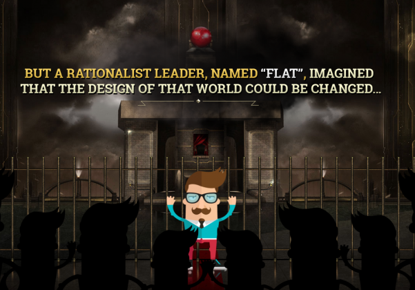
Specifically, flatvsrealism.com is a stunning and easy to grasp what it is (note: you can turn the music off in the top right corner).
Click to visit the site
Where it came from
Like any design trend, it’s impossible to say ‘yes, this came from here’. But there are, of course, always going to be influences.
One major factor for the rise of parallax scrolling has been the influential flat design trend.
Basically, before flat design, there was realism or skeuomorphic design. This emphasizes reflections, drop shadows, and a variety of other techniques to give individual icons and elements a 3D look.
Thus, parallax scrolling, with its objective to give depth to 2D objects, doesn’t really work. With flat design being decidedly not 3D, all of the sudden, there was a design potential to exploit – parallax scrolling.
The second factor that accelerated and catalyzed parallax scrolling was the single page website. The single page website provides a sound base for a parallax experience by providing clear information architecture as well as SEO potential.
And by looking at successful single-scroll website, it’s easy to see the creative leap necessary for parallax scrolling to emerge.
Challenges and tribulations of parallax
Unfortunately, parallax scrolling isn’t all sunshine and rainbows. It’s got its problems, specifically from a user experience perspective and from an SEO perspective.
The user experience
The problem with parallax is that it’s not a great user experience.
First, the technical complexity required to build parallax scrolling is reflected with load time. Parallax sites far more frequently require some form of loading screen before they launch.
On a phone, this delay is even worse, and the challenge becomes promising enough value to users to get them to hold on (assuming that it’s a positive mobile UX anyways).
If there isn’t enough perceived value, the user is unlikely to stay until the site loads.
Parallax sites, while cool, often struggle with conveying information as well. The exception is building something akin to an infographic, but conveying information in a more conventional way is extremely hard.
Parallax sites done well can create an awesome experience, but often fail with actionable advice or CTAs. For example, a service-based company would struggle to tell its audience its core offering through a parallax scroll website.
Plus, users are forced to scroll through an entire experience, even if what they know what they want is at the end.
It speaks to a deeper ideological challenge with parallax scrolling UX. They’re generally sites that are designed to show just how talented the designer is. Which is great, but it doesn’t do a great deal for the user.
SEO
The second major challenge with parallax scrolling is that it’s impossible to optimize for search engines.
Keywords are – for the most part – ruled out. URLs, information architecture, link structure – any of the likely SEO points you can pick up are nullified by parallax scrolling. It doesn’t matter how cool your site is if no one can find it.
The positives
All that aside, there are still many positive uses of parallax scrolling.
At the end of the day they are pretty cool. And for something like a brand, an image-heavy website, or experience-based advertising (think Red Bull), they’re great.
In general, it works better if you’re not heavily reliant on organic search and branding is critical to achieving your business goals. For example, a business like Sony could make an excellent use of a parallax scrolling microsite, and in fact they have before.
Parallax scrolling is also a great way to showcase a particular product. Oakley does a particularly good job of this, demonstrating everything about a product in a simple and elegant way.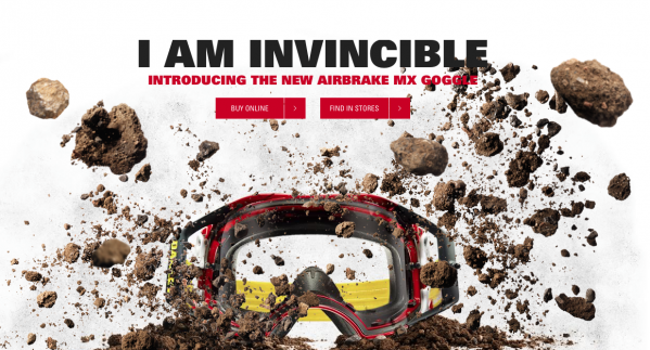 Click to visit site
However, if you were actually looking for product specs, like if you were comparing several different products, this parallax scrolling site would be absolutely infuriating.
Conclusion
Parallax scrolling has really taken a hold on web design, because it allows designers a lot of creativity and is a superb avenue to tell the story of a product.
For brands looking not so much for the hard sell but more the soft branded approach (especially if their products are well known and not much research is needed) then it’s an awesome option.
However, when you choose to go parallax, what you gain in creative leeway you sacrifice in user experience and in SEO value.
All in all, parallax sites are good product or branded micro sites, but we feel that the trade-offs are too high to really ever be more than fringe trend.
