New tech, new rumours.
With the impending release of the iPhone 6, rumours, leaks and speculation have predictably arisen. First and foremost being its larger form factor and screen size. With Samsung’s Galaxy line of phones (and other Android and Windows phones following closely behind) redefining phone screen sizes as bigger, and the consumers unanimously seeming to agree, Apple, though once describing their modest 4” screen as “a dazzling display of common sense,” may be wanting to play catch up.
What Screen Sizes Can We Expect?
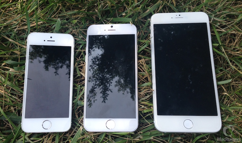
The iPhone 4’s 3.5” screen stretched to 4” with the iPhone 5, so it isn’t out of the question with the iPhone 6 for Apple to think even bigger. In fact, early leaks predict the sixth iteration of the prototypical smartphone to have both 4.7” and 5.5” versions released simultaneously.
Since the advent of the touchscreen smartphone, phone screen sizes have progressively been getting larger, and for good reason. This means less strain on the eyes,
greater usability, and greater resolution and pixel count (more clarity and sharpness). The popularity of the mobile web would arguably not have reached the fever pitch it has without larger screen sizes.
Increasing screen size also drives home the apparent trend of our smartphones slowly replacing the desktop as our primary computing devices. They’re no longer tools to simply make phone calls and browse the web. They’re no longer simply utilitarian devices, but multi-purpose fun ones as well. We watch Netflix on our phones. We take photos on our phones.
We record videos on our phones. With this in mind, the trend of increasing screen size makes perfect sense.
How a Larger iPhone Affects Your Mobile Website
A larger iPhone screen means great things for mobile website design, if developers and designers use the screen real estate wisely.
As mobile devices approach more uniformity in their viewport sizes,
responsive media queries can become more standardized and easier to configure for developers. There’s more screen to work with, meaning less cramped user interfaces and more space to strategically place content.
This means the possibility for more negative space and minimalist design choices, and less chance for clutter and noise. A bigger screen also means more efficient spacing for links, making them easier to hit and making site navigation much more fluid/functional for users that are literally “all thumbs.”
Larger screens are great for readability as well; web designers and developers can set a responsive or mobile site that has the text size precisely set for readability with that bigger screen size. Reading web content becomes less strenuous on the eyes as users won’t need to hold the device as close to their face, or change the text size by pinching or pulling on the screen. The extra screen real estate also means more variety for the mobile web, as many more potential layouts and design choices open up to designers and developers to fill the screen with.
What Web Designers Should Be Thinking
These are all things web developers/designers need to take into consideration when building
new responsive or mobile websites, as smartphones slowly but surely, with the iPhone soon to be the latest convert, standardize to bigger screen sizes.
As a last note, designers should make use of the bigger screen intelligently and creatively, allowing for designs that are not only functional, but that visually pop. Aside from more functional content placement, readability and layout variety, bigger screens also mean the capacity to display crisper images, logos and multimedia. No longer does the mobile web have to play second fiddle to their desktop counterparts visually. In fact, with bigger screens, if the space is used correctly, mobile sites can now look much better, cleaner, and well put together, than their desktop counterparts.
Even
Apple, once the staunchest contrarians to bigger smartphone viewports, with the late Steve Jobs once even quipping that 4” Android phones looked like skateboards, now seems to be on the bandwagon.
Ultimately, users on average seem to agree that bigger screens are nicer to look at. Whether the mobile web makes the necessary changes to curtail to this however, is still ultimately up to the developers.
