Why mobile is important
From behind a desk in an office, faced with two giant monitors, it’s not always evident why mobile is so important.
Particularly for B2B companies, it’s easy to argue away mobile experiences, saying ‘well, who’s going to buy a complex hardware system on a phone anyway’ or ‘well, our deep sea drilling equipment is a person-to-person business.’
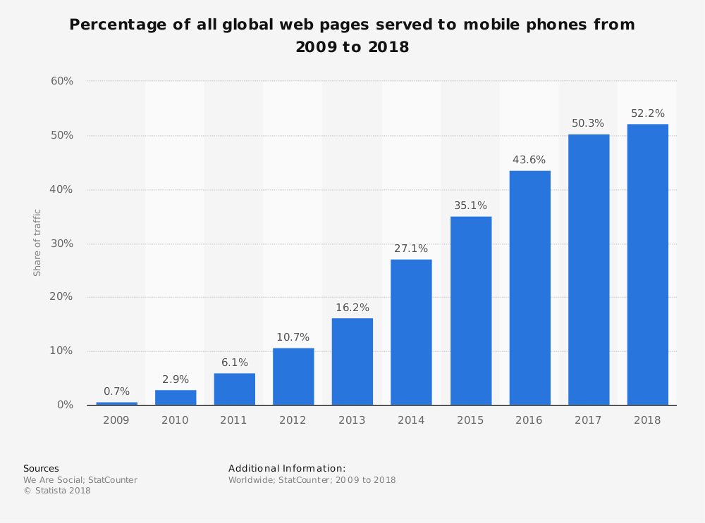
But to put it in perspective, mobile traffic now accounts for more than 52% of all web traffic, up significantly from only a few years ago.
This is just for now, of course. These mobile projections only increase as we go forward.
The trend is clear: for the past 10 years we’ve been moving towards a more mobile world, fundamentally redefining how users engage with the internet.
We’re now at the point where ‘mobile-friendly’ is no longer optional, but ‘desktop-friendly’ could be.
Mobile strategy basics

First, forget about the mythical mobile user who only wants to find your business’s phone number or address.
Mobile use-cases have evolved, and you should expect any activity that can be carried out on your site by a desktop user should be easy to access and carry out on a smartphone.
Mobile Strategy is about Customer Experience
Customer Experience (CX) is what it’s all about, and businesses need to ask CX questions to improve their mobile experiences.
Take for instance an ecommerce business. If there is a low conversion rate on mobile, instead of focusing only on driving a mobile user towards the checkout, the business may be better off working to address problems with browsing products. For example, adding product filters, in-depth product descriptions, optimized search results, and fast load times on a responsive site (so the full catalog is accessible).
It’s better to solve the problem that people have rather than what you might imagine from a mobile user with a limited agenda.
Also ask where your customers are when they’re browsing. If they’re in-store, how can you improve the experience vs when they’re on their couch at home or in-transit?
Businesses need to use these questions to inform what the problem is and how they’re going to solve it.

By asking CX questions, you might uncover some mobile-specific features that would benefit your users, like in-store locators, a mobile coupon campaign, or a cross-channel ad campaign.
Now, the customer has a better mobile experience, but they also have:
- More tailored information (from the in-store locator beacons)
- Better engagement with the brand
- Seamless experience from on-screen to in-store (from the ad campaign)
The takeaway? Mobile strategy isn’t just mobile. It’s the role of mobile within a larger context.
One way to think about it is like a wheel. Mobile strategy is one of the spokes, and the customer is the hub.
Mobile strategy solutions
Here are a few common mobile techniques to include in your mobile strategy, when they’re good, and when they’re not.
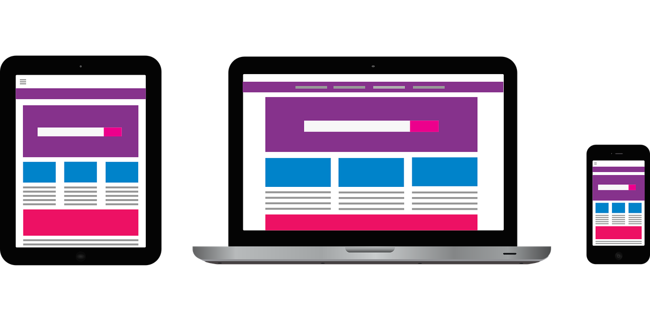
Responsive web design (RWD)
Responsive web design is a great way to get your site mobile friendly in a hurry. It’s easy to implement with responsive templates for Wordpress and other CMS platforms, and it means there’s only one body of content for you to manage. Your site will work basically the same way regardless of what device you’re on.
However, if you consider the drawbacks of responsive design, namely the weight of the code and a compromised mobile experience content-wise, a responsive site is perhaps not the best approach.
Pros
- One site reduces maintenance costs of maintaining content
- Seamless user experience, regardless of device
Cons
- Difficult or impossible to provide a contextual experience or content
- Navigation and menus can be problematic if trying to force the desktop experience to work on a smartphone
- Depending on the implementation, the user experience can feel like an afterthought tacked on to a desktop site.
Considering responsive design? Take a deeper dive in our article Guide to Responsive Design
Discrete mobile websites
Discrete mobile websites were popular for a brief period before mainstream responsive design took off, but the trend was largely abandoned because of the costs associated with managing two separate experiences.

However, as CMS platforms continue to evolve and make it easy to push content dynamically to multiple digital platforms, discrete mobile websites are poised to make a comeback.
If you have the technical capabilities to manage one, a discrete mobile website is a much better option for phones.
Pros
- They’re lighter than responsive sites, meaning faster load times – especially important for users browsing on 3G networks
- They allow you to prioritize mobile-friendly content, e.g. compressed videos and images
- They tend to have a better mobile experience because they’re device specific rather than device agnostic
- They don’t require users to install anything (compared to an app, which requires a download)
Cons
- Higher maintenance costs than a responsive site due to additional mobile templates
- A disconnect between the desktop and mobile design or content can confuse users who visit across different devices
- Though closer to an in-app experience, content is not available offline (as it is through an app)
Learn more about the differences between responsive design and mobile sites in our article Mobile Website vs Responsive Website
Mobile apps
While a mobile app will exclude desktop-only users (if those even exist anymore), it will vastly improve the experience for mobile users.

Mobile apps are faster on phones, include richer interactions, allow you to effectively use features like push notifications, and are essential for communicating with wearables.
Moreover, mobile apps are much better at creating a seamless online/offline experience. For example, a clothing store app might update its inventory and store the data locally on a user’s device when it’s connected to WiFi. Then, users can browse the catalogue to their heart's content while offline, and only use their data when they’re ready to buy.
Pros
- Single-functionality creates a great user experience: it’s more tailored, works better, and is better at what it does
Cons
- High cost of development, and attracting users in the early stages can be challenging.
- Requires managing a second-screen experience (though this may not be a challenge, depending on your CMS).
Mobile content strategy
We recently looked at the importance of multi-channel publishing for your content marketing efforts and showed how you could use a CMS to manage your publishing strategy, whatever the channel. This is an important aspect of any mobile strategy.

How to focus on mobile in multi-channel publishing
You may have multiple channels for mobile, since (as we discussed above) you may choose to deliver content via a responsive website, a mobile-optimized website, a mobile app, or a combination of the three.
Over time, you will want to create content that works anywhere, and that's where a CMS can help.
Using a CMS to manage content will make your multi-channel publishing strategy more efficient. A big factor in this is the creation of flexible templates that can pull mobile-specific content pieces into shape for dissemination via a mobile website or mobile app.
Good template design means focusing on issues like mobile navigation and page load speed. Google wants to see mobile page load times of under a second - can your CMS deliver?
Beyond that, there's the content itself. With the smartphone becoming the default device for many users, mobile content is no longer short content - people are also reading long-form content.
That's why a big part of mobile publishing involves tagging content appropriately so that your CMS can categorize, extract headlines, descriptions and excerpts for improved browsing across smaller devices.
The bottom line is you want to create an excellent experience for your customers.
Put mobile at the heart of your multi-channel publishing strategy and you'll be ready for continued changes in the market.
Guidelines for a mobile content strategy
- Don't cut back on content you provide to a mobile user, but do in-depth analysis and make it easy for mobile users to get the content they need – and the most-needed content most easily.
- If you can support adaptive content in responsive design, do so, but optimize the navigation and search features for small screen views.
- Create and manage content in small blocks. Think first of the mobile user, and design initially for the small screen. It's usually easier to start there than to shoehorn design and content for a large monitor into a smaller device.
- Think in terms of content living on its own, not as it is disseminated onto screens of different sizes. Organizationally you need to create platform agnostic, independent content.
- Text and image preparation must be evaluated in the context of publishing processes and may need to change.
- Review your mobile and desktop statistics separately and then compare.
Mobile video

Mobile now claims the lion's share of video consumption, with more than 50% of YouTube's views comes from mobile devices. In the future, that figure may seem conservative.
There's no doubt about it: mobile video is huge. And the important thing to know for your business is it produces more engagement and click-throughs than desktop video.
Video works well for:
- Quickly informing your customers about your products and services
- Increasing the likelihood they will buy something
- Engaging with them and keeping them on site with entertainment and information
- Social media, where visual content dominates the sharing statistics.
- SEO – video appears regularly in search results, and YouTube is the 2nd largest search engine in the world.
All this adds up to the fact that no business can afford to ignore video. Using video in your mobile content marketing mix allows you to provide the type of content that you already know your customers want.
And it's not hard to get started, either.
Most businesses have employees or executives who speak about their products and services at industry conferences and networking events. Record those and you have your first online video.
You can also take another approach, using branded video to make consumers laugh, or touching on an emotional issue that affects most people.
If you don’t have native video management tools in your CMS, leverage platforms like YouTube and Vimeo to upload and embed in your content.

Tips for mobile-first design
Ask: what exactly do mobile users want from your website?
Primarily, an easy way to find the information they want as quickly as possible.
Here are some ways that might work. As we've mentioned before, the user interface is a huge deal:
- Your mobile website will allow users to navigate easily by swiping and tapping. Eliminate hover-states that can be useful on desktop and opt instead for actions driven by clicks or taps.
- Most users need big buttons for functions with enough space between them so they don't select the wrong option by mistake. Ensure your mobile design takes this into account and resizes calls-to-action as necessary.
- Users want navigation that only appears when they need it and disappears when they don't. Make your navigation smart and sticky.
- Users do not want long, complicated forms. Reducing complexity is a great guiding principle for any mobile interface. All the bells and whistles you have on your desktop site don't mean a thing on mobile.
- People want features that aren't relevant to what they are doing to be out of the way.
- Rather than storing information for later, people are searching for it at point of need and then acting on it quickly.
Conclusion
With UX and CX increasingly playing starring roles, mobile strategy is all about providing what the customer wants, when they want it, in an easy, accessible, and usable format. If companies can do that, then their mobile strategy is off to a roaring start.
Mobile strategy is a fickle and complicated beast. By following a few basic tenants, companies can take full advantage of the current mobile trend.
