In this post, we drill down into what the grid format is, where it came from, and why it’s important for developers and designers.
Quick note: we’re talking about grids as a visual feature of the user-facing design, not as a design strategy. (e.g. using a grid overlay on Photoshop to help you design a better web page. If that’s what you’re after, Mark Boulton is your man.)
What it is
The grid format is pretty much exactly what it sounds like – it’s a way of organizing information in a grid.
Each grid square is basically a receptacle, waiting for designers, developers, or community members to put their content into.
Clearly, this system has a number of very handy benefits.
First, it means that the organizational system is super clear for the user, straight away. For example, if you show someone Pinterest or Instagram, how it’s organized is immediately clear to them.
That’s the magic of the grid. It’s familiar to users (good) and it’s also just super simple (also good, and we’ll go into more detail later).
Where it came from
The short answer? From print.
The long answer? Grids have always been used to make conveying complex information easier.
Think about a map. While you obviously can’t turn the world into a perfectly organized grid, you can overlay the world with a grid. We call this grid latitude and longitude.
But back to the print!
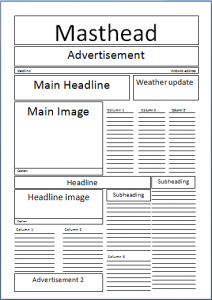
Newspapers were some of the first printed works that reflect what web design has become. Yes, books emerged as the first grid-based writing, but with only 1 column per page it’s a little bit cheating. Newspapers, however, have lots and lots of columns per page, hence the grid (and also the term writing a column).
Another reason why newspapers were so important as the fore-fathers of grid-based web design is that they faced a lot of the same problems that web designers face today:
- They are very information-dense
- The information is often unrelated to each other in almost every way (compare, for example, a column about food and a column about the political situation in the Middle East. Very different.)
- They need to be quick and easy to read – people skim the web the same way they skim a newspaper
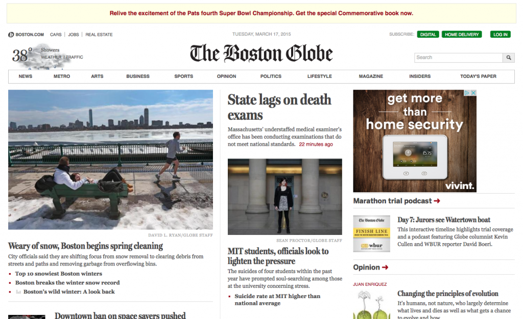
So newspapers are responsible for a lot of grid-based design. For a nice example of this online, check out
The Boston Globe’s website (it gets a special mention because it’s an important landmark for responsive design).
The other major influencer that has led to grid-based web design was the art movements in the 1960s and 1970s.
Andy Warhol, for example, and Gerhard Richter both worked extensively with grids. While they fell out of favour for a little bit in the 1980s, the core functionally of a grid endeared it to web designers.
Why it’s important
Ah finally! The why. Why should web designers and developers care about grids?
It makes everything easy.
And that’s a big plus. We’ve already mentioned how it
enhances the user experience, because it lets user instantly know where information is going to be, and provides containers for information that’s unrelated.
For example, imagine a Pinterest feed. You might have five columns with four rows on your screen at a time. That’s 16 unique and pretty autonomous pieces of information!
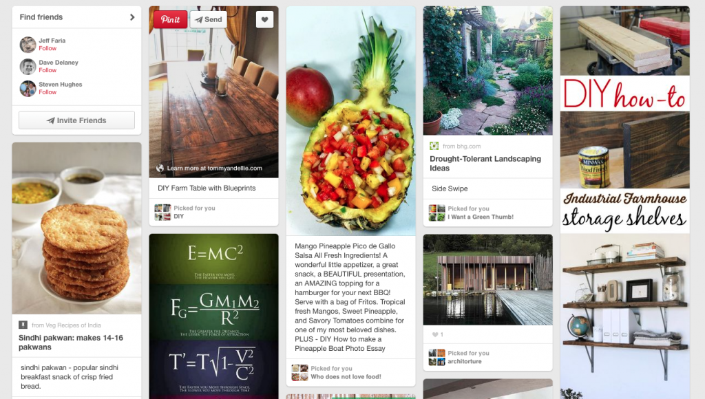
A grid lets you see, process, and move on from those 16 pieces of information in the quickest way possible.
It’s responsive.
And this solves just so many problems.
Responsive design is based on the idea that you have a bunch of containers (e.g. grids or cards) that resize, and thus whatever’s inside them resize as well.
It’s
literally built on squares, so it makes sense that a grid format will go hand-in-hand.
It (can be) flat
This is more of a handy-dandy thing than a make or break, but it’s undeniably useful that a grid format, with it’s clear lines and emphasis on functionality,
gels so well with flat design.
For an example of this, check out
Uberflip:
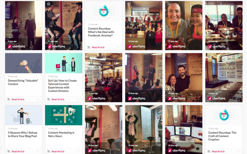
They’re a content marketing automation program, but their product looks essentially like a grid-based format for content organization. And guess what? It’s super flat. So that’s a useful thing about grids as well.
What we’re trying to say…
Is that grids tick a lot of boxes. They’re easy for the user,
they’re responsive, and they happen to be very adapted to the current global design trend. All of which is really good for designers.
They’ve been around for a long time, and we think they’re going to be here for a while longer.
