A major website overhaul can be the bane of any organization. It’s expensive, it’s hard to know exactly what to do, and it can mean the better part of a lifetime spent in procurement.
Oftentimes, it’s not apathy that leads to companies to keeping website designs long past their use-by date – it’s dread. And what’s worse than going through all that, only to realise your site wasn’t so bad after all?
Here are a few quick tests you can run to see if your site might be due for buff and polish. (And don’t worry – they’re super easy.)
1. See if it’s responsive
This doesn’t take emulators and coding experience, CSS3 or HTML5. All you need is a desktop computer and (maybe) a phone.
What you’re testing for
You’re
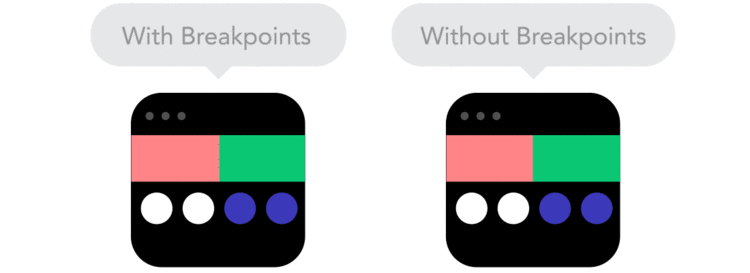
testing to see if your website’s responsive. That is, does the content on your website ‘respond’ to the screen size that it’s being viewed on? Basically, you’re going to see if your site provides users with a good experience or bad experience when they visit
via a mobile device.
What you do
Open your website on your desktop. Let’s say it’s
Moveableonline.com. All you have to do is drag your corner across the screen and see if the website ‘responds’ to being repositioned into a small space. Does the content rearrange so it fits to new window, or does the horizontal scroll bar appear for the desktop equivalent of pinch and zoom?
 Pro tip
: look at the menu at the top. Does it condense into a logo or the Hamburger icon? If so, it’s probably responsive.
If you’re still not sure, open your site on your mobile phone. It should look great if it’s a responsive site, with the page’s elements resized and repositioned to be optimized for a smaller screen.
What this tells you and why it matters
If it’s
a responsive site, great! All your mobile traffic is having a good experience on your website! That’s awesome.
If, when you look at your site, the scroll bar came up, and it became a nightmare to navigate with lots of horizontal scrolling just to get to the end of the sentence, then that’s the experience your mobile traffic is having.
With over half of all browsing traffic in the world projected to be coming from mobile devices this year, the mobile experience is a crucial part of your website.
Responsive design is a nice middle ground between purely mobile, with
dedicated mobile sites and
apps, and purely desktop, with normal non-responsive design. You only have to maintain one body of content, and every single user gets the same experience – guaranteed.
2. See what your 404 error page says
There are few things as frustrating as getting a 404 error (quick aside: a 404 error is the generic error code when a client can’t communicate with a server. In layman’s terms, it’s what happens when someone clicks a broken or dead link, like when you’re browsing a webpage, click an interesting link, and it goes nowhere).
Not every website has them, and you should be working hard to minimize the ones that you do have. The thing is, it’s extremely,
extremely hard to be 100% error free. If you’re blogging regularly, let’s say twice a week, and you’re linking to, say, two sources per article, you’re linking to 16 different websites a month. Round that to 20 to account for image attribution, and after 6 months you have 120 links at least that might be taken down or deleted. It’s going to happen.
So your users are going to get a 404 error, despite your best efforts.
How to see what your page says
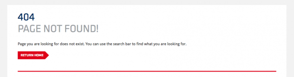
All you have to do is type in your URL then /404.html. So for us, it’s
www.moveableonline.com/404.html. What happens? Are you taken to a simple, default text-based paged that says nothing more than the fact that there is a 404 error? Or is it customized?
For example, our error page is customized, with two ways for the user to get out: return home, or use the search bar. It’s simple, it’s straight forward, and gives the user some options of where to go next.
However, if your page is the former, without any customization at all, you might want to start looking into a redesign. One of the core tenants of
a good user experience isn’t to make a flawless product (although we should all try).
Rather, it’s to provide great error recovery to the user. It’s far better to admit that yes, sometimes things go wrong, but when that happens we’re prepared than to just ignore any potential problems and hope that they don’t happen.
3. Check your contrast
This can be as easy or as complex as you like. AODA has some compliance regulations which of course you should be striving for. But for a quick and dirty check, we recommend
accesskeys.org. It’s a super easy online tool that lets evaluates the contrast on your site without having to know the HEX or the RGB codes of your background and fonts. Just enter your URL and go for it! (note: read the result carefully, because it’s not the best phrasing).
Why it’s important
First, readability and clarity. You can have the best product in the world, but if no one can read your website, it’s irrelevant.
Second, the Canadian government is actively pushing Canadian companies towards AODA compliance, and a huge part of that is contrast (you can learn more about
AODA compliance and access ability right here).
The challenge is that
flat design tends to push
thin fonts and light greys, so it’s easy for contrast to slide into unreadable, especially if it’s on a low-quality monitor, a small cell phone, or if your users are just distracted. Making sure your contrast is right is a quick and easy fix, but an important one – don’t let it go unattended.
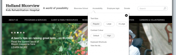
And if you don’t want to sacrifice the colours on your site, adding a contrast control (like on
Holland Bloorview or RCDO’s sites) will give you the best of both worlds.
Wrap up
Before you even get into making a great new website, take a step back and see if you need one. Use these three steps as a guide to see if your site is outdated, hard to use, or just plain looks bad. Getting a poor site fixed sooner rather than later will usually save you a few headaches, not to mention make your users an awful lot happier.
Didn’t do so hot with our tests? Contact us now to learn how we can help. 