We recently published an article about designing for mobility, and how truly mobile organizations have begun targeting customers not just on demographics, but also on their needs at a particular moment in time.
While we touched on some of the digital tools companies use for that targeting these audiences, we didn’t fully explore their core strengths and weaknesses.
In this article we focus on mobile websites and responsive design, what each excels at, and who should be using what.
Mobile Websites: Pros and Cons
Mobile websites are one of the first examples of mobile web design, and they remain exceptionally good at their job (especially when it comes to mobility).
Pros
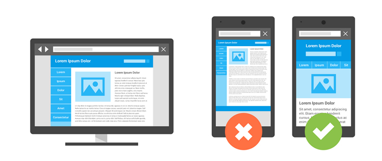
Mobile sites can tailor their content to mobile users. This allows site creators to lead with messages and functionality that are suited for people on the go, or just simply working on a smaller screen.
For example, Scotiabank’s online banking page built for desktop has lots of information on it – ads for mortgages and debit cards, online security information, and more.
Check it out below:

However, the mobile version has just two things: a form field to enter your account number and a form field to enter your password.

This design is much better suited for mobile devices
By using a mobile site, Scotiabank solves two problems at once:
- They address the problem of slow sites over mobile networks like those ads for cross-selling products slowing things down. It's important to remember that what works on a desktop won't always work on a mobile device.
- They dial into precisely what the person on the go wants. Entering data on a phone can be hard, but Scotiabank makes it as easy as possible with clean, clear forms (that are nice and big for those of us with fat fingers!)
Mobile sites can run faster on mobile phones. Like the Scotiabank example above, mobile websites can be optimized much more ruthlessly than standard websites. As a result, they tend to be lighter, faster, and more efficient.
Mobile sites generally improve the user experience. All of these factors combine to mean that a mobile site will generally improve the user experience for mobile users.
It’s not all sunshine and rainbows, though. Mobile sites do come with some serious baggage.
Cons
Mobile sites require dual maintenance. With mobile sites essentially self-contained websites in their own right, they generally require a similar amount of maintenance as their desktop version to keep running. This includes development time and resources, but also content refreshes and updates, design updates, brand updates, and all the other softer, non-dev elements that make a website tick.
Content can quickly become outdated. Content is worth a particular mention for mobile sites. The problem is that any website that regularly updates its content, for example, an e-commerce site adding new products, will need to update two sets. It is hard to keep both sites synchronized without a robust back end, and is all too easy for the mobile site to start to slide towards outdatedness.
Who should use a mobile site
 There are many websites that can benefit from a mobile site, largely because of the gains in user experience (UX). However, some sites are better suited than others.
Websites with established processes, where users want to do the same few tasks again and again, are great for mobile sites. These sites have low content loads, and, once the process is in place, tend to be much more hands-off products than other types of websites.
Sites with lots of content that need to be refreshed regularly, like a blog or an e-commerce website, tend to not be quite so well suited to mobile sites, unless back-end tools are in place to support efficient multisite management.
Responsive Websites: Pros and Cons
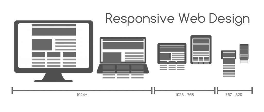
Responsive web design took the world by storm when it first kicked off and has maintained its popularity despite an ever-changing mobile landscape.
If you want to know if your site (or any site for that matter) is responsive, just resize your browser window. If the site shrinks to fit the new size of your window (i.e. ‘responds’) then it’s a responsive site. Easy!
Pros
There’s a reason that people love responsive design. It’s a great system to present your website in a user-friendly way, for almost any device your customers may be using. That, in itself, is a huge benefit.
In an ideal case, a responsive site would look equally good on a desktop computer, a TV screen, a tablet, and even a 4” screen phone. That flexibility buys some significant peace of mind for site owners.
 The second major benefit (especially over mobile sites) is that it’s all contained in one body of content. What this means is that if you produce a great landing page, you don’t have to re-create that page for a mobile site, and for your big screen desktop, and for any other screen you may want to optimize for.
You create it once and the container that you put it in will automatically shift the objects to fit the screen it appears on.
What this also means is that whatever content you produce will be easier to maintain, update, and edit, since you only have to do it once.
Cons
First, while responsive sites are functional on mobile devices, other device-specific tools (like apps or mobile sites) are generally going to offer a better mobile experience.
You can think of it this way: responsive is a good all-rounder, while mobile sites are the specialists.
Second, responsive design is significantly limited by its very responsiveness. Because you’re only maintaining one body of content, you can only create a website experience that caters to the needs of one party.
Take, for instance, a restaurant. Someone browsing on a desktop computer might want to see a menu, prices, and an online booking form first and foremost. Mobile users may want to see the address and phone number front and centre, with a bottom navigation bar to switch to the menu, photos of the food, and online reservation system.
 With mobile sites, you can accommodate those different needs; with responsive design, you have to be a bit more selective.
Who should use responsive design
Companies who are focused primarily on mobile traffic would do well to go responsive. If most of your traffic comes from desktops the trade-off in specific functionality is less important.
Companies who are updating content on a regular basis should also consider responsive design. The challenge of maintaining two sets of content when you’re updating weekly or daily quickly overwhelms content teams – it’s just too time consuming.
So blogs, online stores with regular product updates, or news organizations are all probably better off going responsive.
Wrap up
There’s no perfect website - it all depends on what your end users want and need, and how you can best provide it.
Websites are nothing more than tools for companies to use, and more important than having the best tool is having the right tool for the job.
