Emotion sits at the heart of good web design. Good design will forge an emotional connection between the user and the product or experience.
However, creating those emotional bonds between a person and something on a tiny screen is no easy feat.
In this article, we’re going to help out by applying colour theory to design. We’re going to cover:
- The psychology of colour
- The basics of colour theory
- How you can use colour theory online
The psychology of colour
The basic idea of colour psychology is pretty straightforward. The idea is that different colours make certain attitudes and behaviour more or less likely.
Unfortunately, beyond broad correlative relationships (e.g. blue is a trustful colour), it’s very hard for us to know why we do this.
Perhaps it’s evolutionary – blue stuff was good, so we liked it, and felt calmed by it. Red stuff didn’t sit well with our ancestors, so we got a kick of adrenaline whenever we saw it, to get us far, far away.
It’s hard to say exactly why, but what we do know is that colour is very important.
One of the best examples of this is from back in the early 2000s. Glasgow was looking for a new way to fight crime, and the solution they hit on was to tint their streetlights blue. That’s it – just a blue tint on key streets.
And the crime rate fell.
From an ROI perspective on crime, you really can’t get much better than that.

So why did it work?
Because people respond differently to different colours.
Theories as to why this particular case worked vary from the cultural (blue is associated with police) to the neurological (blue has a calming effect on people).
Regardless, the takeaway is that the colours we see have a big impact on both attitudes and behaviour.
Basics of colour theory
Marketing and branding (design’s close relatives) have been using colour theory for decades to drive sales and build brand value. For example, have you ever noticed how many financial services companies have blues in their logos?
The Royal Bank of Canada, Royal Bank of Scotland, Bank of Montreal, Goldman Sachs, Moody’s – the list goes on.

That’s because blue is seen as a trusted colour, communicating authority, order, and responsibility. These are pretty good things if you’re a bank.
Other colours carry other connotations, like activity and excitement. Red sale signs, for example, are red because red is the colour of excitement, action, and energy.
If you’re a store trying to drive sales, then you want to instill those emotions in your prospective customers.

Green and pink are fairly obvious – green is clean and environmental, and pink is feminine, loving, and sensitive. Purple and yellow are sort of wild cards.
Purple is a mixture of creative type brands (think Cadbury’s) as well as companies like FedEx and NYU.
Yellow is equally bizarre, with optimism and youthful extroversion but also warmth and friendliness.
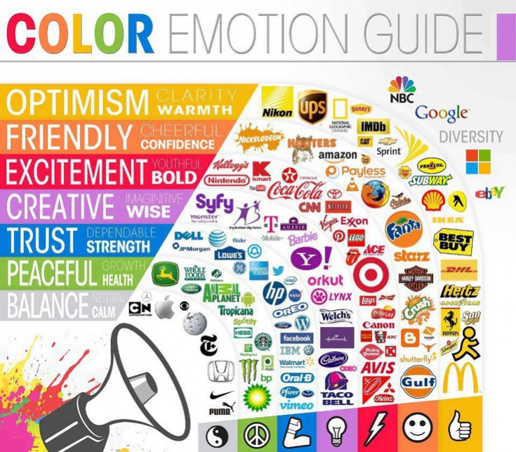
So with colour, companies can influence both behaviour (for example sale signs) as well as attitudes (for example brands).
So the next question is: how do you take those general findings into specific deliverables?
Colour theory in web design
The most important caveat is that colour theory depends on what a colour means to your specific audience. So while blue might be trustworthy and authoritative (in a good way) for some audiences, it might also be totally inappropriate for others.
Rather than relying on a comprehensive list of where to put what colours, it’s better to think about what elements might benefit from having some colour psychology applied to them.
Call to Action (CTAs)
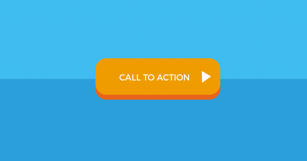
Of course, one of the best examples of applying colour theory effectively is CTA buttons.
First, CTA buttons are easy to colour any shade of the rainbow.
Second, CTA buttons are extremely important – they’re one of the only elements of a design that you can nearly guarantee your users are going to interact with.
And third, they happen at a key moment in the user journey – when you’re asking them for something. And as an added bonus, they’re super easy to test!
Colour palette
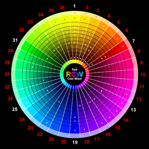
Colour theory is critical when you’re choosing a colour palette for your app or website. There are 3 basic formats for colour palette:
- Triadic: three colours positioned 120 degrees away from each other on a 12 step colour wheel
- Compound: this uses four colours, two contrasting and two paired
- Analogous: choosing three colours, all next to each other (complementary)
These are all effective ways to build a colour palette for a website, but each have strengths and weaknesses associated with tem.
Triadic is the best all-rounder, good if you’re not confident with the brand values of the website you’re building.
Compound relies on heavily contrasting colours, so can appear a bit garish, if not used properly.
Finally, analogous palettes are the best for reinforcing one key brand value, like trust or energy.
Accents
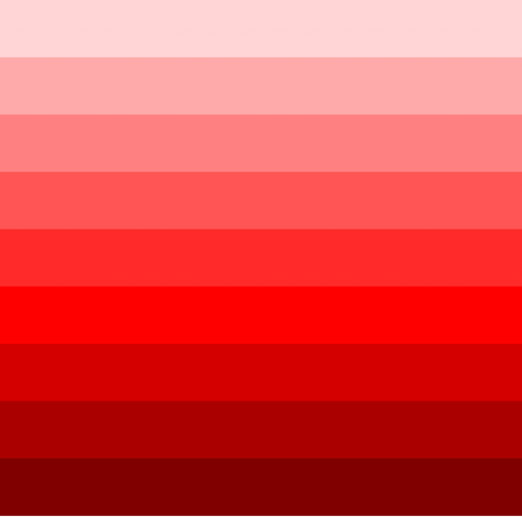
Accent colours can carry huge weight and tremendous emotion in web design if used correctly.
A red accent, for example, can drive excitement and activity on a site, whereas a blue accent might make a site feel legitimate and responsible.
Especially by using colours in their pure form (pure red, pure blue) without softening them, accents can help you drive home the emotional response that you want with your audience.
Conclusion
Colour theory is a way of understanding colour in terms of our own attitudes and behaviours, and the effect that even a touch of colour (if properly used) can have on the overall impression of a website.
With colour, designers can better form emotional connections between the audience and the product, and create a better experience in the process.
All it takes is picking just the right shade of fuchsia.
