As curious creatures, humans have been exploring since the beginning of history, and this exploratory nature has carried over to our digital lives.
We use terms like (buyer) journey, (site) maps, navigation and search (engines) to express how people explore online, and it is the reason your website or app structure is so critical to the user experience.
One question we keeping hearing from clients is: how can you maintain a great navigational flow as your traffic moves to mobile?
The challenge of mobile navigation
Unlike a lot of other mediums, the biggest limiting factor to effective mobile navigation is available real estate.
The more robust and detailed your navigation, the more space it takes up. The more space your nav takes up, the less space in which you have to do stuff with your website or app – like sell things, feature content, convert leads, or tell stories.
Moreover, some of the best practices used in other parts of mobile design don't really work for navigation.
Navigation needs to be easy to see, easy to understand, and easy to use, because navigating isn’t the fun part of browsing your site.
Mobile navigation solutions
There are some universal aspects to mobile and desktop navigation.
First, it needs to be discoverable.
If your users can’t find your navigation, then they can’t use your navigation.
The second thing all navigation needs to be is accessible. Does it help users find their way to what they want quickly and efficiently? Is it easy to use?
Instagram does a great job of this.
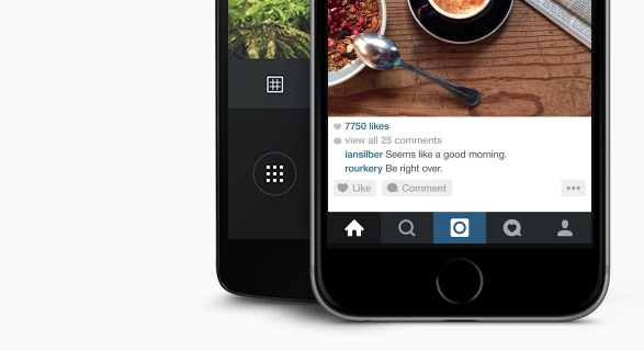 They make it very easy to find each aspect of the app while the physical functionality of the navigation (for example, button size and padding) makes it simple to use, even when your attention is elsewhere.
So how do you make navigation simple, discoverable, and accessible? It turns out, there are a number of solutions.
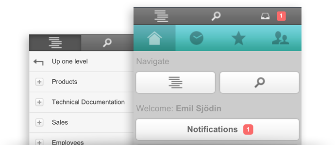
The hamburger
The classic. Loved, hated, contested. Regardless how you feel, it’s impossible to get away from the fact that the hamburger has established itself as a key feature in mobile navigation.
Pros
- Small, discrete, easy to fit into a mobile UI. Which is great when screen-size is at a premium.
- Significant recognition as a navigation icon. With widespread use spurred on by mobile giants including Facebook, the hamburger is likely to be recognised for what it is.
- Provides the opportunity for an in-depth navigation menu. Not everything is as simple as Instagram or Facebook. Some websites and apps, for example, large e-commerce sites like Amazon, have immense navigation challenges. A hamburger icon is a superb way to circumvent some of those.
Cons
Louis Abreu wrote a brilliant critique of the hamburger menu but here are the highlights (or lowlights).
- Out of sight, out of mind. The core problem with the hamburger is that it puts the navigation out of sight. This vastly reduces discoverability.
- Increased friction. It’s another thing you’re asking users to do to get around your site.
- Not glance-able. Users can’t glance down at a notification (for example) and instantly know what’s going on.
Who should use it
The real advantage of the hamburger menu is that it allows you to have a really big navigation menu on a small screen.
Sites with lots of different navigation needs, like e-commerce websites and the websites of large organizations, such as hospitals or universities, would be well suited to a hamburger menu, disadvantages and all.
However, for most simpler or smaller sites, there are better options out there.
Navigation tabs (top or bottom)
 Navigation tabs at the top and/or the bottom of a screen are the latest rage in app design. And for good reason – they offer a number of advantages over other options.
Pros
- Extremely discoverable and accessible. From anywhere in a website or an app, users can know where they are and where else they can go. It’s the gold standard for both of these.
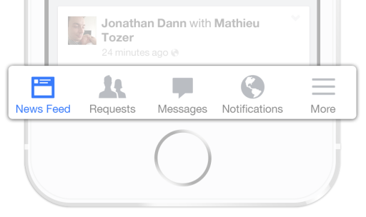
- Excellent glance-ability. A simple tab-based navigation means you can have tab-specific notifications appear quickly and easily. For example, LinkedIn uses a tab-based navigation structure which allows it to quickly inform users when they have new messages, feed updates, and LinkedIn requests.
Cons
- Restricted navigational options. The main drawback of this format is that it means you can only have a handful of navigation options. For larger sites, this type of menu quickly becomes impossible to use.
- Eats up screen space. While the impact on screen space is relatively small, it’s still there. As device size shrinks (think wearables), the screen space you’re sacrificing for the convenience of a persistent menu could be enough to frustrate the user more than it benefits them.
Who should use it
With its limited navigation functionality, the only real cases where this can be easily adopted is apps. Simple apps at that – particularly in social media. It’s just too restrictive for most mobile websites.
Top navigation bar
The top navigation bar is the less elegant sibling of the top navigation tab bar and a carry-over from the time of desktop-only design.
Pros
- Allows robust navigation without sacrificing discoverability. By being ‘always-on’, the top navigation bar means that discoverability isn’t impacted nearly as negatively as other navigation options like the hamburger. For example, a newspaper might have a dozen categories, but reserve their top navigation for the three most popular sections and a ‘more’ drop down menu option. The navigation is always there, but still allows that expanded menu detail.
Cons
- Uses valuable screen space. The top navigation bar tends to be a bit of a hulking mass, eating up a significant amount of prime screen real estate.
- Was really designed for desktop. It’s clear when you see top navigation bars that they’ve been adopted from desktop to mobile. This isn’t necessarily a con, but what tends to happen is that mobile users end up treated the same as desktop ones, despite potentially having very different needs.
Who should use it
The top navigation bar is best for sites that generate most of their traffic from desktops. The continuity across devices is valuable if browsers are used to seeing your site on a bigger screen.
Navigation hub
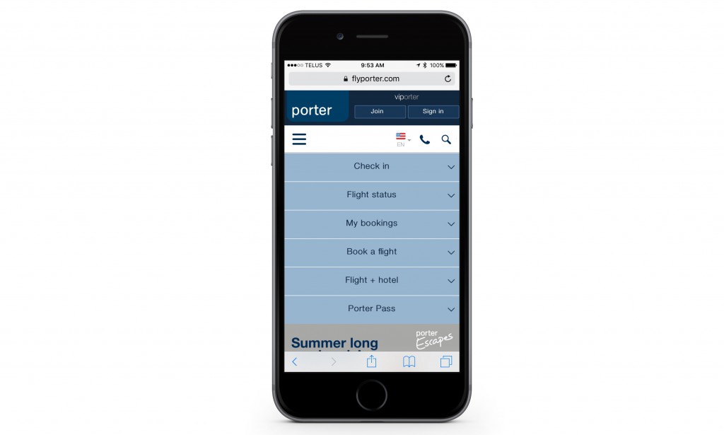
Finally, the navigation hub. It’s like a landing page, but with navigation. Not as popular as some of the other options here, but maybe it should be…
Pros
- Allows clear communication of all potential destinations. From the very start it affords a company a deep level of control over the customer journey, allowing better optimization and, in turn, a better trip.
- Simple, fantastic way to express a complicated navigation. It’s like an abstract for your website – a quick overview of what users can expect to find and how to get there.
Cons
- Not good for browsing. Of course, by front-loading your navigation in a hub, you’re making it much harder for a user to jump straight from one journey to another.
- Doesn’t support users linking straight into a site. If you’re reliant on all your navigation at the start, users who land within your site will struggle to know where they are and what to do.
Who should use it
This form of navigation is absolutely excellent for one specific type of website: websites that have crystal clear user journeys, each with a distinct user group.
Airlines websites, like Porter, are an excellent example of this.
Generally, users are either going to be checking in, buying tickets, or checking a flight status. It’s unlikely that users will be doing more than one of those tasks at a time.
Conclusion
Navigation is always a delicate balancing act between providing the information that users need to get where they want and actually standing in the way of the user journey. This natural tension is heightened on a mobile device.
With less screen space to work with, each pixel matters more.
To make matters worse, there’s no such thing as a standard navigation menu.
The best solution is to find the one that’s best suited to your specific website for your specific users.
With just a little bit of luck, you’ll find your way.
