Designers and marketers frequently fail to see eye to eye. Designers fear that their beautiful creations are going to be overridden for commercial reasons, while marketers tend to see design as the window dressing to their campaigns.
The truth though is that the gap separating good design and effective marketing (digitally, at least) is slowly shrinking, and the two are merging into one. Users are intolerant of poor design, going so far as to consider ugly sites untrustworthy.
Today, for marketers to drive conversions and designers to stay in the job, they need to work together.
Here are 4 examples of designers and marketers doing exactly that.
1. Clear CTAs
No one is going to buy your product online if they can’t figure out your call to action. CTAs are all about clarity – telling people exactly what to do next. And it’s traditionally a point of friction between marketers and designers. Marketers want clarity, concision, and ease. Designers want their CTA to look good.
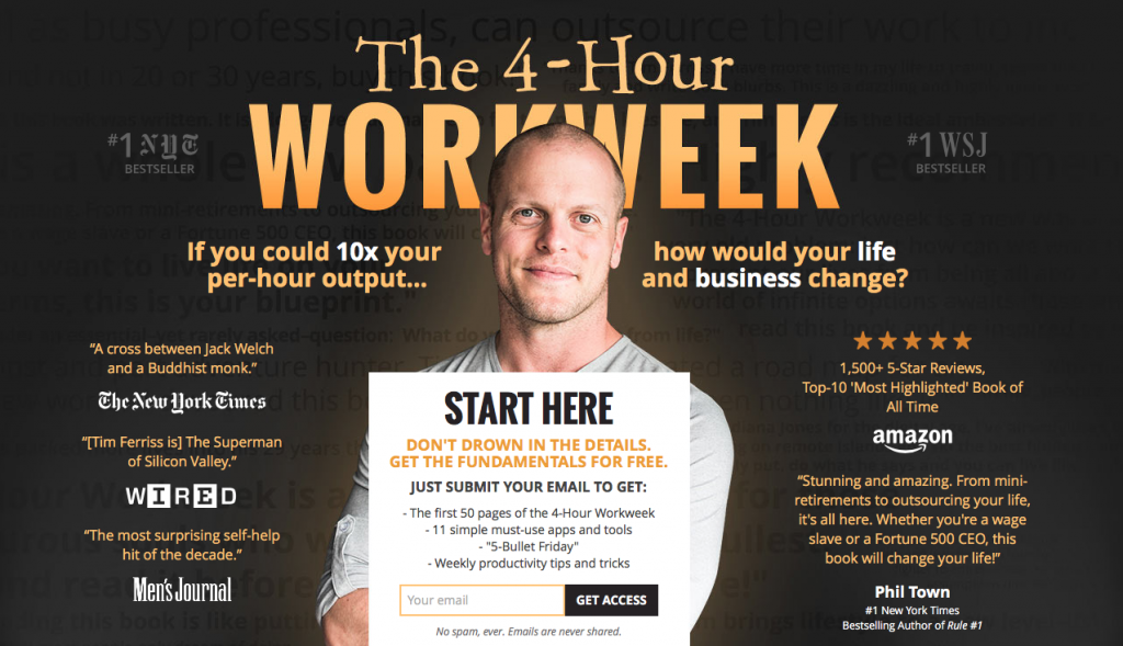
Tim Ferris of the 4 Hour Work Week does a great job of this on his site.
What stands out? The CTA. Where does your eye go? Exactly where the marketer wants it to.
But it works within the overall design as well. It’s like the CTA is beautifully crafted to integrate with the site, not a tacky button added on at the last minute. Marketing and design, at their very best.
2. Social Proof
Social proof. Loved by marketers for its instant street cred, potentially loathed by designers for putting gross words and logos all over their beautiful design.
But it doesn’t have to be that way! Slack’s homepage is a great example.
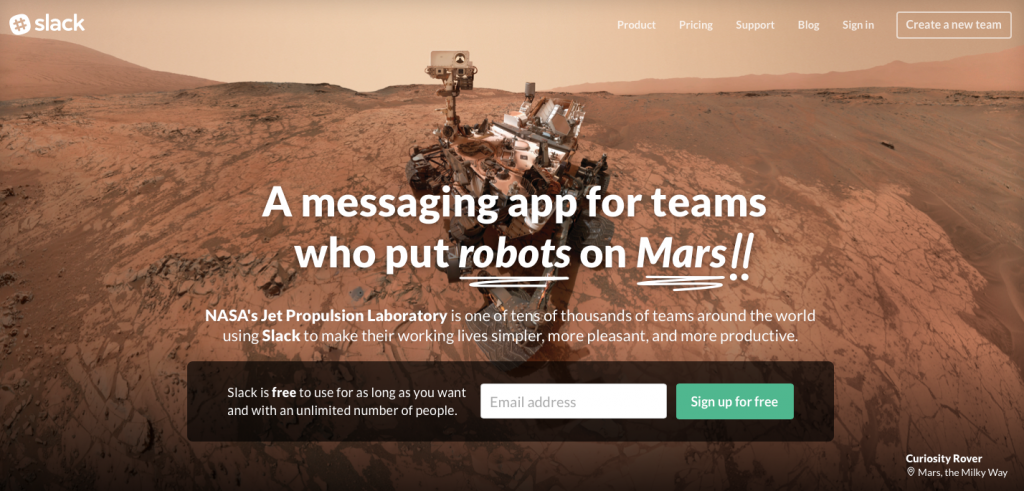
The first thing you see: social proof about a robot on Mars. But it’s tasteful – instead of just saying ‘used by NASA’ or putting NASA’s distinctive logo on their site, they’ve incorporated the concept of social proof into their design with an interesting background image. The result is a social proof which is both visually stunning and extremely effective.
Used by rocket scientists!? Sign me up!
3. Focus on the Copy
In the hierarchy of web design and marketing, it goes:
Copy.
Everything else.
While video engagement and images are important, you’re still going to need copy to do the heavy lifting when it comes to communication and engagement.
So design needs to highlight that quality copy. And the name of the game? Simplicity.
GOV.UK is the best example of this. Simple hierarchy, concise, and copy-centric. The landing pages tells users exactly what to do and how to do it. All design needs to highlight copy as clearly.
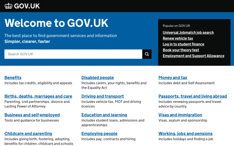
Just to take one example, almost all of the links on GOV.UK are blue and underlined. Classic, standard, easy to read and even easier to understand. It’s design at its best.
Sure – it could probably be prettier. But clearer? No way. And that’s why GOV.UK is now the template for government sites all over the world.
[contextly_sidebar id="hyBziOf8n2130v5tKENtnK2u7XbLey9k"]
4. Scrolling design
Scrolling designs are the way of the future. (This is in contrast to paginated designs, which have little content per page and lots of pages).
A scrolling site is generally going to convert better, reduce bounce rate, look great on pretty much any device, and be shared more. Not to mention that there are dozens of services that makes it a very cost effective option for businesses. Basically, scrolling sites are better.
But maybe the biggest benefit for marketers today is that scrolling sites facilitate storytelling far better than their paginated counterparts. A scrolling site lets you, the designer and marketer, control the order that your user experiences your site in. Not precisely, of course, but far more than a paginated design. And that means you can write a beginning, a middle, and an end, with micro conversions that build on each other to a final bigger CTA. Basically, you can control how the story unfolds.
Strikingly (who actually sell scrolling website design templates) does a great job of this.
[caption id="attachment_3509" align="aligncenter" width="625"]
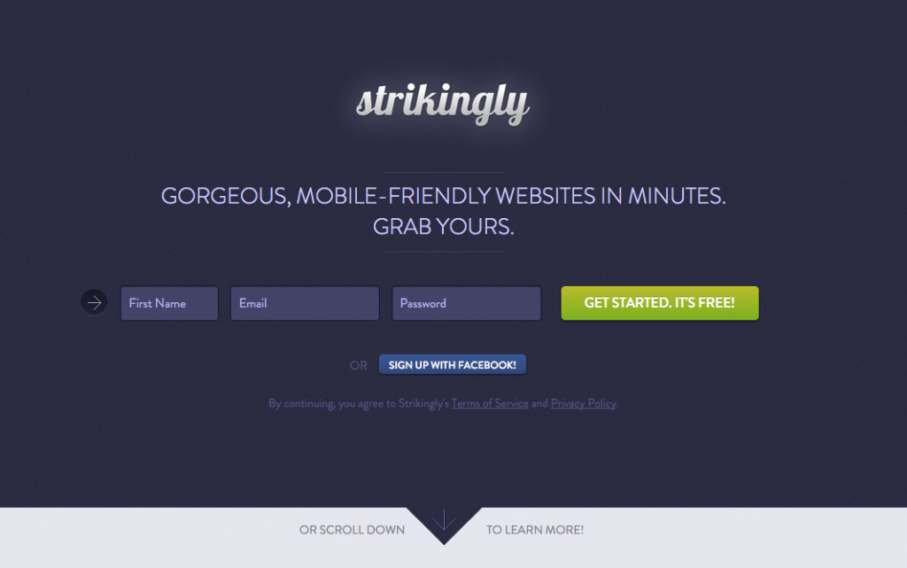
Click to view example[/caption]
Each separate section of their homepage is a micro-conversion bookended by larger ones:
- It opens with a CTA
- Progresses to social proof and examples of their product in action
- Explains the major pain points Strikingly addresses (fast editing, great results)
- Explain more nitty gritty details (e.g. analytics , SEO, URLs)
- More social proofs
- Another CTA that mirrors the first
As it goes it tells the story of Strikingly – what it does, why you would want it, who else uses it. Each one is another step up the conversion mountain, pushing users inexorably towards the conclusion that – yes! Strikingly is for them.
A paginated site would be much less effective. For example, you might land on social proof but not know what the product is. You might land on the CTA at the end and have no idea if it’s any good. Remember that Strikingly is a website template company. There are dozens, maybe hundreds of competitors offering similar products, plus millions of free options through WordPress and other CMS platforms. So it’s a heavily commoditized marketplace. Strikingly is working to confirm sales by telling the story of why they’re the best – a story best told with the scroll.
Conclusion
Both design and marketing are really about understanding users – their pain points, their motivations, and their desires. They’re both empathetic professions at their core. While marketers use that empathy for money, designers use it to streamline the user experience, or create a product that resonates and works for the audience.
So although the end goals might be different (make money vs make a product), the processes along the way are the same.
The thing is, stuff that sells well is designed well, and stuff that is designed well needs good marketing to sell.
As we’ve seen, the more that designers and marketers can work together, the better off each on is going to be.
This article was inspired by the fantastic work of the crew at Crew. You can check out their full blog right here.
