Once a month, we profile a design trend that we’ve noticed making a splash, looking at where it came from, when you might use it, and a couple of examples of someone doing awesome stuff with it. This month, we’re looking at single page websites.
Single page websites
Single page website design is when instead of having a dense, cascading information architecture, you have one, single page of content that users scroll through and experience in order.
Think of single page websites like one big tower of blocks – each chunk of content you provide (say, About Us, Services, and Contact) is a different block that the user scrolls through.
Little John Ferrigamo, for example, has about an About block, a Gallery block, a Contact block, all stacked on top of each other. And with a persistent menu at the top that takes you straight to the block you want (like an elevator taking you to the right floor) it’s simple, but still easy to get around.
Single page websites are really the culmination of a number of trends that have been trucking along since last year. Namely:
- Minimalist, clean design
- Enormous images
- Reduced copy
- Simplified architecture
- Mobile friendliness
- Story telling
These all come together to make simple, elegant single page websites.
First, simplicity. By having simple navigation and relying on scrolling instead of menus, it makes your site really easy to use. It removes a lot of decision making from the user, so it’s always clear what they’re supposed to do (not all decision making though – that’s key).
Second, it provides a huge canvas for equally huge images, so your site looks great.
Third, it makes it mobile friendly. Since it’s only one column, it looks great no matter what the screen size, and how people actually use the site is going to be largely the same (since scrolling is device-agnostic).
And finally, storytelling. By building a site that offers a clear path to the user, you have a bigger hand in structuring how the user experiences your site and thus can craft the story accordingly. It’s more a case of actively guiding the user through your brand’s story, rather than passively hoping that they experience your site the way you intended them to.
Are single sites a good idea?
Like all design trends, single-page websites are not a one size fits all. Some companies and brands are going to be exceptionally well suited to single page websites, while for other sites it doesn’t make any sense at all.
The good
Generally speaking, single page websites lend themselves to visually driven websites that don’t require very much copy and (preferably) have only one or two core messages. For example,
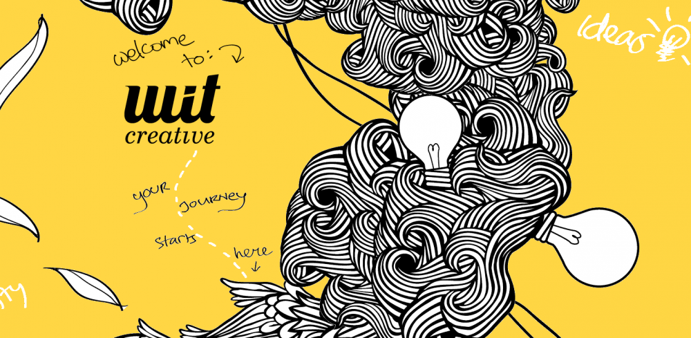
Wit Creative is a small creative agency who use a single page website to introduce themselves, tell people what they do, who they work with, and how to get in touch.
Another example is
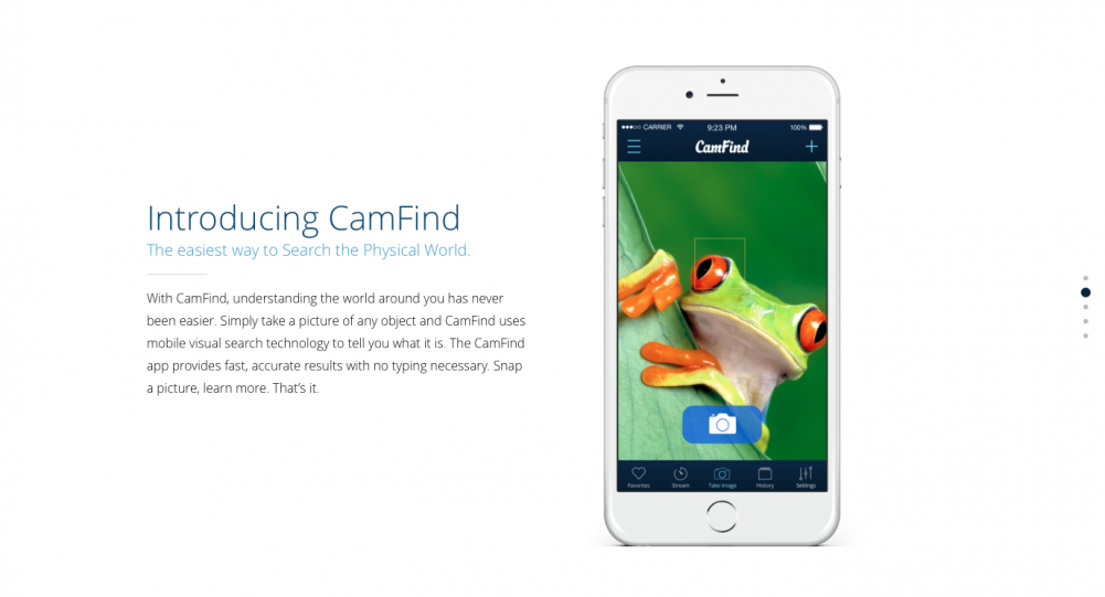
CamFind, an app that lets you take pictures of stuff and then searches for information about that thing you took a picture of. So you could take a picture of a movie poster with CamFind and it would return you all the movie times in local theatres for that film. They use a single page website to explain their product, highlight some of the functionality, and then
push users towards a CTA at the bottom.
The bad
However, single page websites do not always fit the bill. Information-dense websites, websites for big organizations with lots of different end users doing lots of different things, or websites that just by their nature need lots of copy generally don’t do that well on single page websites.
Think about
The New York Times. It would be impossible to condense that down to a single page website. Likewise, a dense organization (
like a university) with lots of different end users including students, prospective students, and support and teaching faculty would be extremely hard pushed to condense that onto a single page.
Wrap up
Single page websites appeal to us for their simple elegance. We like to think that the complex world can be distilled down to a few blocks, orderly, easy to follow, telling us a story. And for a lot of organizations, their products and offering can be. However, the challenge is that single pages, for some anyways, are just too restrictive to retain a positive user experience.
We predict that the forces that drove the evolution of single page websites in the first place, trends like
mobile friendliness and
minimalist design, are going to stick around. And that’s why singles themselves are here to stay as well.
But even if your site isn’t quite right for them, you can still embrace the ethos of simple and elegant web design, for a simple and elegant site.
