How you present data is an essential part of how useful that data is going to be. And with more data than ever to deal with, dashboards are now an essential part of web design.
1. Supr.admin
This dashboard theme is clean and simple, and most importantly it puts the information that you need right now front and centre. In the example above, they’ve highlighted a web analytics platform. It’s easy to see total visits, unique visitors, and other key metrics over a 30 day period. An effortless snapshot.
Why we loved it
- Great snapshot of what’s going on
- Fully searchable
- Endlessly customizable
2. Fitbit
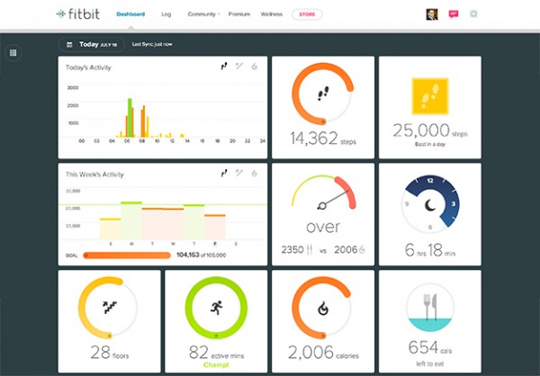
Fitbit separates themselves from other fitness wearables by displaying their users' stats in the best way possible. Of particular mention is their use of circles to indicate progress. It gives users a quick, effortless overview of where in terms of achieving their goals.
What we liked
- Simple, circle design make it easy to visualize progress
- Card-style format is flat and clean
- Recent activity is prioritized in the dashboard, so you see results of stuff you just did quickly
3. Webapp Pro dashboard
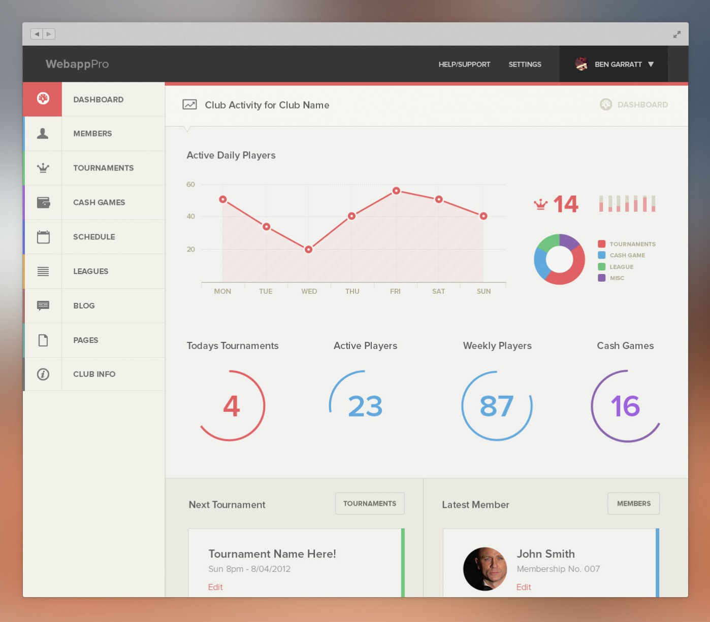
A dashboard designed for a gaming app, Webapp Pro embodies beautiful data display. Easy to read and great to look at, it does wonders to make data fun.
Like Fitbit, they use circles to indicate progress. This is both elegant and fast to process. However, it’s not clear if users can set goals.
For example, can you set a goal for active players, and as you approach that goal the circle fills in? If so, Webapp is even better. It provides app developers with a concise summary of the health of their app. This is often difficult to tease out from a list of downloads or even from a spreadsheet of profits.
What we liked
- It’s really pretty
- It focuses on key stats, providing a snapshot of app health
4. Eventbrite
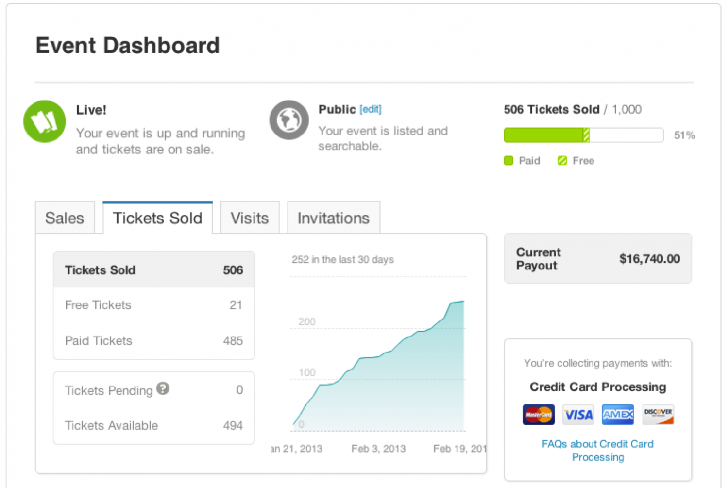
Granted, it’s not as pretty as Webapp Pro. But don’t forget the core function of any dashboard – to convey information quickly and easily.
While we’ll be the first to admit that the Eventbrite dashboard isn’t the best looking, it’s absolutely one of the most functional. In about three seconds, event admins can check their ticket sales, their ticket sales over time, how they’re collecting payments, how much they’ve collected, how many tickets they have left to sell, and other essential event details. It’s simple and effective, and we for one love it.
What we liked
- It’s a great snapshot of an event
- It’s not overloaded with details
5. Mixpanel Survey Analytics
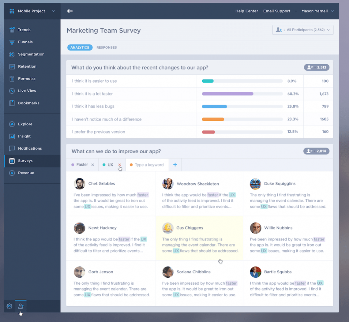
Surveys present a unique challenge for dashboards. They’re jam packed with useful information, but those nuggets are often hidden within comments. Mixpanel does a nice job of combining both the analytical results of a survey as well as the anecdotal results. And by making those comments keyword searchable, Mixpanel lets users delve into them quickly and effectively, pulling up the information that they want.
What we liked
- Keyword search provides tremendous flexibility
- Total participants is fast and easy to see, so you know if your results are robust
Conclusion
These are five dashboards that really stood out to us for their simplicity, their functionality, and the beautiful design.
