1. The Carousel
Contentious, we know. But the carousel is a prime example of designing organization-first, not user-first.
See, carousels tend to crop up when big, complex organizations can’t decide what to put on the homepage. A carousel gives five different department heads access to the same prime homepage real estate.
But for the user, again and again tests indicate that it’s an ineffective way to consume content, and generally ends up wasting that valuable space.
Consider either http://shouldiuseacarousel.com or Neilsen Norman Group’s usability study on carousels.
Instead, designers should be working towards minimalism and flatter homepages.
One way to do this is a beautiful full screen image with simple, clear messaging. Another, trendier way is to have a video playing in the background (PayPal does this effectively).
2. Baseline Image Rendering
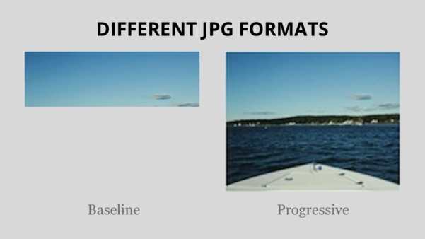
There’s debate over baseline rendering or progressive image rendering, but we’re coming down hard on the side of progressive images.
Progressive images are when images load a little bit at a time to give users the rough outline of the picture before snapping to clarity (if you need an example, scroll through Facebook pictures really quickly).
Baseline images load from the top left to the bottom right, line by line. It’s the classic example of dial up internet, when an image loads 30 percent perfect, 70% not at all.

There are a couple of reasons we’re all for progressive images:
- It embodies the attitude of a minimal viable product (MVP)
- They give the user extremely rapid feedback that something is happening, and they’re doing the right thing
- They give the user a rough idea of what they’re looking at, so they know if they want to proceed.
Consider the Facebook example. Let’s say you’re flicking through your friend’s pictures from their trip to New Zealand.
While you love your friend, you don’t really care about pictures of them – you want to see pictures of stunning scenery!
If an image loads a little bit, and you can tell it’s just a selfie of his face, you can move on. With baseline images, you can’t do that – you’ll have to wait much long to see if you want to stick around or not.
3. Using images as text
This might seem like a great way to get your page looking pixel perfect – but in reality, you’re only hurting yourself.
For starters, websites are interactive properties – creating a static image, no matter how beautiful, is probably not going to create a positive user experience.
Plus, using images instead of text (especially for headings) is likely to hurt your search rankings and accessibility.
Finally, what if a user is looking at the text only version of your page, say on a mobile phone? The most responsive site in the world won’t be any use at all if the navigation is missing.
With so many fonts and so much beautiful typography out there, it’s super easy to achieve a beautiful site without compromising UX or SEO.
So scrap the images, and write some proper headings.
4. Autoplaying music
We agreed this is our least favourite design trend. Users are listening to music, sitting in a meeting, browsing during a movie and suddenly they’re embarrassed by the terrible music now coming out of their phone.
It’s a problem, and there’s very little justification for it. Sure, it might get users to go back to a site to close down the music, but it might also get a user to simply leave and never return.
And it’s such a simple fix!
Just stop auto-playing music.
Some ads recently have only started playing if a mouse hovers over them for a sustained period of time – that’s an easy way to present information in a video but keep your users happy and embarrassment-free.
5. Multi-page articles
We’re not talking about articles that are just long. We’re talking about when you find an interesting article like Top 10 Great Foods For The Summer Season only to find that it’s 10 individually-loading pages, each one with about 150 words on it and some pictures.

The practice started because if you display everything on one page, you can sell advertising to that page once. If you split it into 10, you can sell that ad space 10 times.
This trend has received a fair bit of criticism before we got to it. But it persists, in part because of marketing and advertising interests.
Instead of writing one article and splitting it into 10 to maximize the value, companies should be writing one or two really great pieces of content, content so good it gets 10 times the number of views.
It’s more expensive, but it offers many benefits.
First, users will love it. Second, it’ll make the entire web full of content as interesting and compelling and enticing as what’s on Buzzfeed and The Verge.
But mostly, it just makes a lot more sense. And a good user experience (as we’ve said before) is virtually always worth the cost in the long run.
Wrap up
Those are some of the web trends that we think need to be put to rest. What they all have in common is that they in some why inhibit whatever the user is trying to do.
With increasing pressures to improve user experience (plus decreasing tolerance by users for rubbish), these trends should soon be on the way out.
And frankly, we can’t wait.
