With 2015 rapidly wrapping up, we wanted to look forward to what we can expect from web design in 2016. Here’s what we think is in the pipeline.
1. Browser-based prototyping
There’s been a progressive
shift towards prototyping for a couple years now. First, under the banner of iterative design, then
in-person user testing, then more automated testing like A/B testing and eye tracker tests.
We think that the next step will be an increase in browser-based prototyping. It will become much more common for designers to create a flow within a browser using real content, drop it in front of a user, and see what happens.
This sort of prototyping will let designers focus much more on real interactions and (we hope) will encourage better micro-experiences for end users.
2. Even more micro-interactions
Speaking of micro-interactions, we think that there’s going to be far more of them going forward into 2016. First,
micro-interactions are interactions that do one thing. The classic example is turning your alarm off on your phone in the morning. It’s one swipe, that does one thing – turn your alarm off.
We think that web design will move to incorporate more micro-interactions in both user flows and general web design for a couple of reasons:
- Micro-interactions generally have fantastic user experience because they’re so simple
- There has been a general trend throughout 2015 towards single-tasking – micro-interactions are an extension of that trend
- Wearables are beginning to be truly mainstream, and with smaller screens, micro-interactions are a far larger part of what they do. We’ll start to see that influence in other aspects of design
- Bad micro-interactions are the little things that really get under people’s skin.
So we think that more and more apps and websites will work to incorporate more (and better) micro-interactions.
3. Return to serif fonts
For years now, we’ve been moving away from serif fonts,
due in part to flat design and in part because sans-serif fonts are a lot easier to read on a screen, particularly at a small size. However, throughout 2015 there’s been huge changes in typography, with
mixed typography reigning supreme for a lot of websites. We think that the next wave of the typo movement is going to be serif fonts.
This trend is driven by two things. First, Google’s
Material Design showed everyone that within flat deign there can be some flexibility; it’s no longer necessary to make everything
as flat as possible to be relevant and on-trend. Second, with retina displays and better screens in general, it’s now practical to have a serif font on a screen that’s legible to read, even at a small size.
[contextly_sidebar id="GrG03apQbgqVEBIa7JYdVFZuvccQb1Bh"]
4. Bold Colours Online
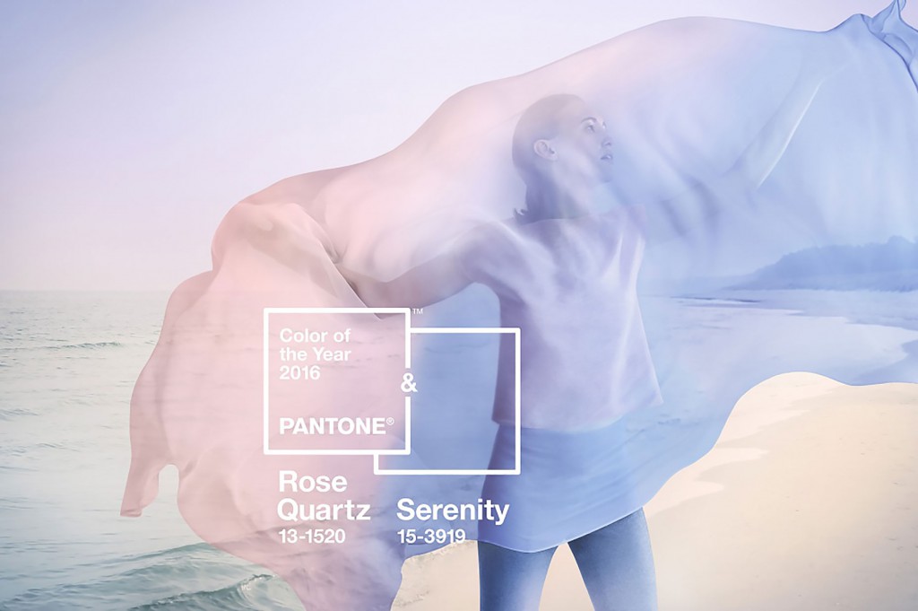
A further impact of high-end displays is that we think bold colours are going to come back big time. UX Pin published this idea in their
trends 2015-2016 ebook, and we think it’s right on the money.
Like we said, part of what’s driving it is better screens. Back in the day, only 216 colours were safe for web designers to use. Now, that’s expanded to millions and millions of shades. So there’s a technical side to this, and it might be a little bit of ‘look what we can do now’.
The second factor driving this is that currently, a lot of websites look the same. It’s the responsive, flat design, WordPress generic site and it’s all over.
Companies are going to be looking for a way to differentiate, and we think that bold colours are part of that move.
5. Custom animation will become the norm
A further effort to get away from the formulaic responsive/flat/WordPress template design, we think that there’s going to be a lot more
custom animation. Custom animation that is fun, engaging, and totally unique. Because it’s no longer hard or impressive for a website to look good. They need something more to leave a lasting impression on end users and with more and more time (and effort!) spent researching and browsing online, it’s important for businesses to stand out.
Hence, custom animation.
6. Site Shrinkage
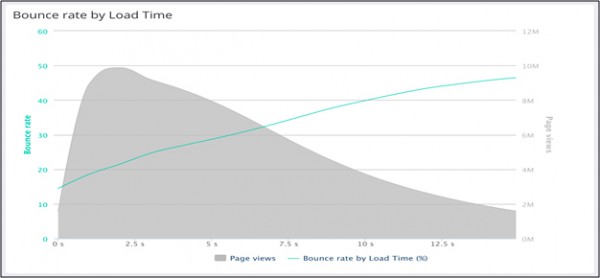
And lastly, we think that sites are going to shrink. A lot.
We published a blog post a few weeks ago about
website weight. Well we think that we’re not the only ones to notice that websites are getting heavy. And since improvements to mobile networks are perhaps a few years away, we think that companies are going to respond by reducing the size of their site.
Examples of a ‘website diet' might include:
- Reducing/eliminating background video and images
- Getting rid of carousels
- Limiting font choices, social media plugins, and other third party elements
- Developing company apps and/or mobile-friendly microsites
- (Perhaps!) scrapping responsive design
Now a lot of these have been trends that have grown through 2015. But come 2016, we think it’s back to absolute minimalism: websites will communicate what they need, and nothing more – but they’ll do it really really fast.
Summary
So to wrap up, and for those skimmers who came straight to the conclusion (we know you’re there!) here are the six design trends we’re going to be looking for in 2016:
- More prototyping
- Micro-interactions
- Serif fonts
- Bold colours
- Custom animation
- Site shrinkage
Think we’re right? Think we’re wrong? Stay tuned and we’ll check back in in a few months to see how our predictions are shaping up! 